
为了让您的通知在不同版本的 Android 上看起来效果最佳,请使用标准通知模板来构建通知。如果您希望在通知中提供更多内容,请考虑使用可展开通知模板。
但是,如果系统模板不满足您的需求,您可以使用自己的布局来构建通知。
为内容区域创建自定义布局
如果需要自定义布局,您可以将 NotificationCompat.DecoratedCustomViewStyle 应用到通知。此 API 允许您为通常由标题和文本内容占用的内容区域提供自定义布局,同时仍使用系统装饰来显示通知图标、时间戳、副文本和操作按钮。
此 API 的工作原理与可展开通知模板类似,都是在基本通知布局的基础上构建而成,具体如下:
- 使用
NotificationCompat.Builder构建基本通知。 - 调用
setStyle(),并传入一个NotificationCompat.DecoratedCustomViewStyle实例。 - 将自定义布局膨胀为
RemoteViews的实例。 - 调用
setCustomContentView()设置折叠通知的布局。 - (可选)同时调用
setCustomBigContentView()为可展开通知设置不同的布局。
准备布局
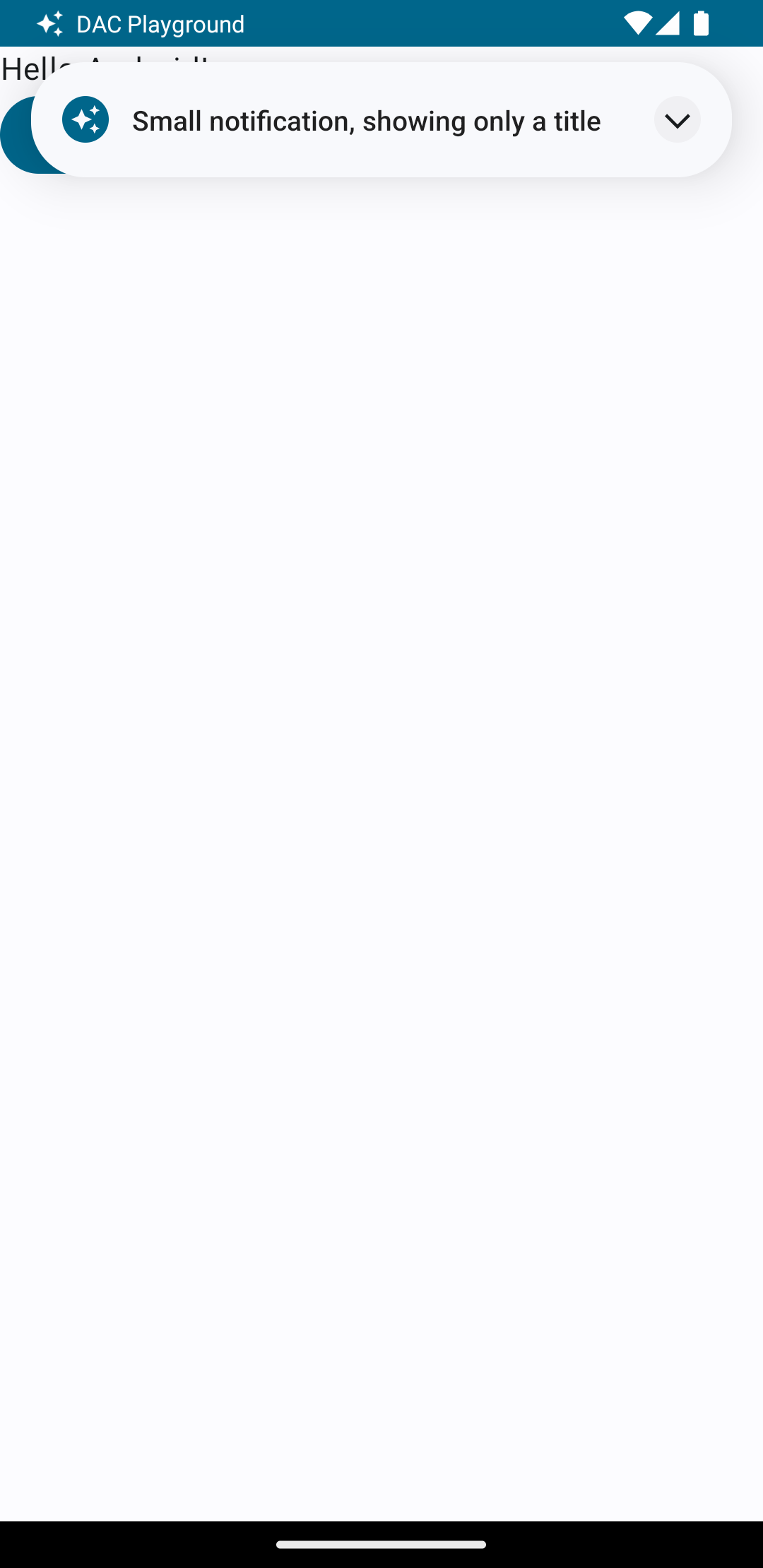
您需要一个 small 和一个 large 布局。对于本例,small 布局可能如下所示:
<?xml version="1.0" encoding="utf-8"?>
<LinearLayout xmlns:android="http://schemas.android.com/apk/res/android"
    android:layout_width="match_parent"
    android:layout_height="wrap_content"
    android:orientation="vertical">

    <TextView
        android:id="@+id/notification_title"
        style="@style/TextAppearance.Compat.Notification.Title"
        android:layout_width="wrap_content"
        android:layout_height="0dp"
        android:layout_weight="1"
        android:text="Small notification, showing only a title" />
</LinearLayout>
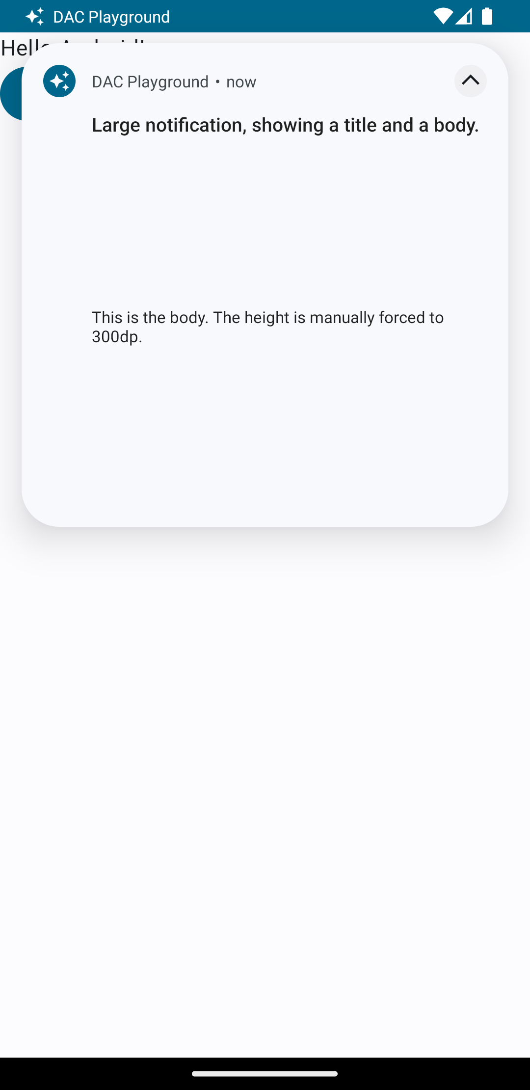
而 large 布局可能如下所示:
<?xml version="1.0" encoding="utf-8"?>
<LinearLayout xmlns:android="http://schemas.android.com/apk/res/android"
    android:layout_width="match_parent"
    android:layout_height="300dp"
    android:orientation="vertical">

    <TextView
        android:id="@+id/notification_title"
        style="@style/TextAppearance.Compat.Notification.Title"
        android:layout_width="wrap_content"
        android:layout_height="wrap_content"
        android:layout_weight="1"
        android:text="Large notification, showing a title and a body." />

    <TextView
        android:id="@+id/notification_body"
        style="@style/TextAppearance.Compat.Notification.Line2"
        android:layout_width="wrap_content"
        android:layout_height="wrap_content"
        android:layout_weight="1"
        android:text="This is the body. The height is manually forced to 300dp." />
</LinearLayout>
构建并显示通知
布局准备好后,您可以按以下示例使用它们:
Kotlin
val notificationManager = getSystemService(Context.NOTIFICATION_SERVICE) as NotificationManager

// Get the layouts to use in the custom notification.
val notificationLayout = RemoteViews(packageName, R.layout.notification_small)
val notificationLayoutExpanded = RemoteViews(packageName, R.layout.notification_large)

// Apply the layouts to the notification.
val customNotification = NotificationCompat.Builder(context, CHANNEL_ID)
        .setSmallIcon(R.drawable.notification_icon)
        .setStyle(NotificationCompat.DecoratedCustomViewStyle())
        .setCustomContentView(notificationLayout)
        .setCustomBigContentView(notificationLayoutExpanded)
        .build()

notificationManager.notify(666, customNotification)
Java
NotificationManager notificationManager = (NotificationManager) getSystemService(Context.NOTIFICATION_SERVICE);

// Get the layouts to use in the custom notification
RemoteViews notificationLayout = new RemoteViews(getPackageName(), R.layout.notification_small);
RemoteViews notificationLayoutExpanded = new RemoteViews(getPackageName(), R.layout.notification_large);

// Apply the layouts to the notification.
Notification customNotification = new NotificationCompat.Builder(context, CHANNEL_ID)
        .setSmallIcon(R.drawable.notification_icon)
        .setStyle(new NotificationCompat.DecoratedCustomViewStyle())
        .setCustomContentView(notificationLayout)
        .setCustomBigContentView(notificationLayoutExpanded)
        .build();

notificationManager.notify(666, customNotification);
请注意,通知的背景颜色因设备和版本而异。在自定义布局中,将支持库样式(如 TextAppearance_Compat_Notification 用于文本,TextAppearance_Compat_Notification_Title 用于标题)应用于文本,如下例所示。这些样式会适应颜色变化,这样就不会出现黑底黑字或白底白字的情况。
<TextView
    android:layout_width="wrap_content"
    android:layout_height="match_parent"
    android:layout_weight="1"
    android:text="@string/notification_title"
    android:id="@+id/notification_title"
    style="@style/TextAppearance.Compat.Notification.Title" />
避免在 RemoteViews 对象上设置背景图片,因为这可能会导致文本难以阅读。
当用户正在使用应用时触发通知,结果类似于图 1:
点按展开箭头可展开通知,如图 2 所示:
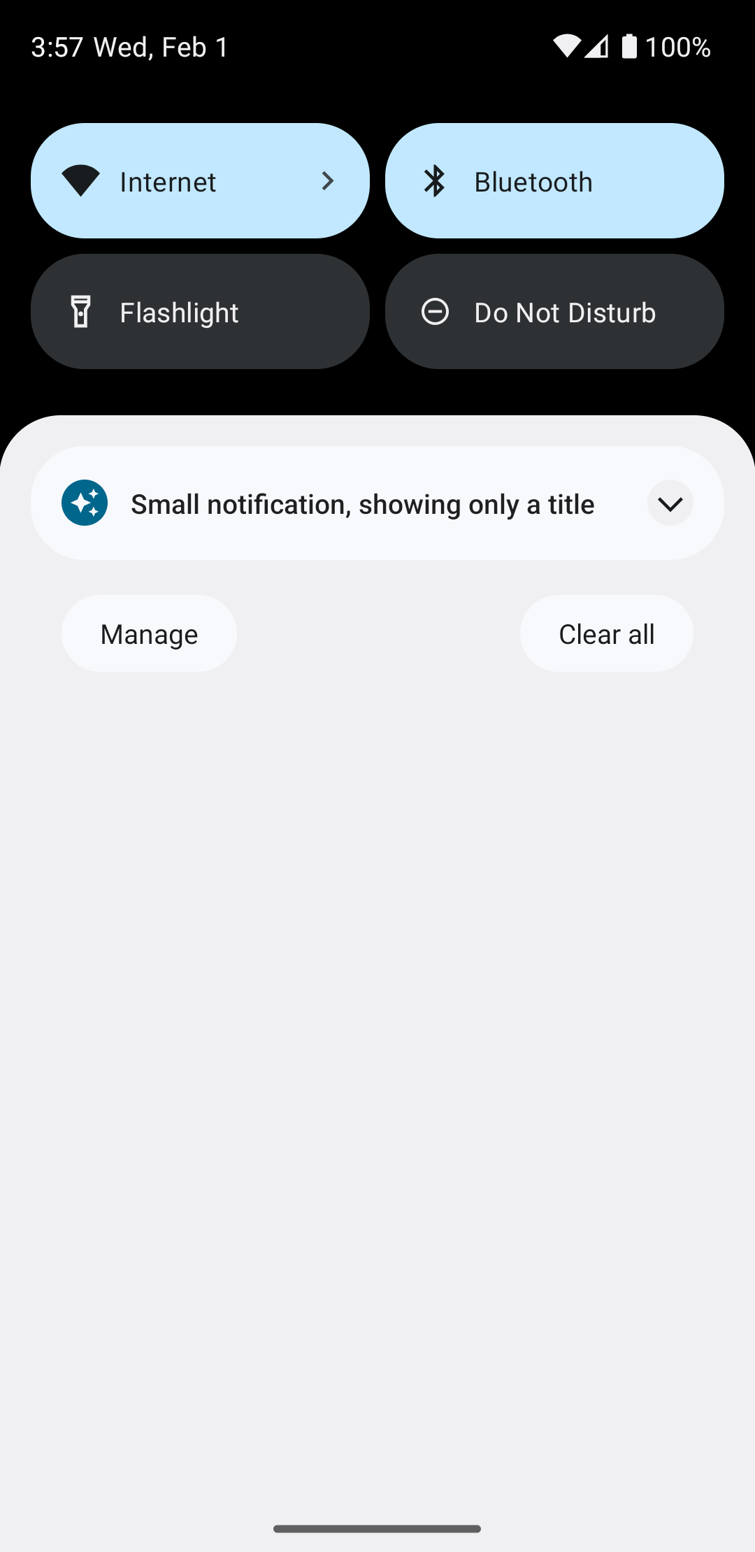
通知超时后,通知仅在系统栏中可见,如图 3 所示:
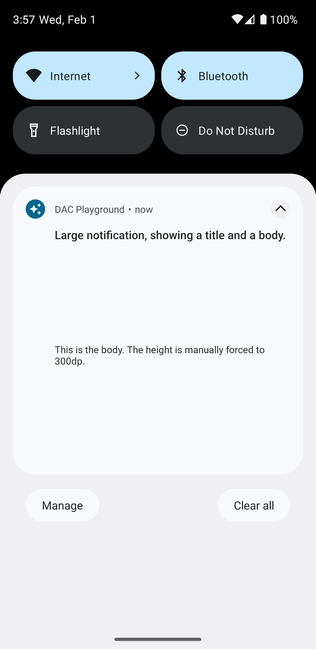
点按展开箭头可展开通知,如图 4 所示:
创建完全自定义通知布局
如果您不希望通知带有标准通知图标和标题装饰,请按照前面的步骤操作,但不要调用 setStyle()。