
按钮包含文本、图标或两者兼有,用于传达用户点按时将发生的操作。
您可以通过以下三种方式之一在布局中创建按钮,具体取决于您想要包含文本、图标还是同时包含文本和图标的按钮
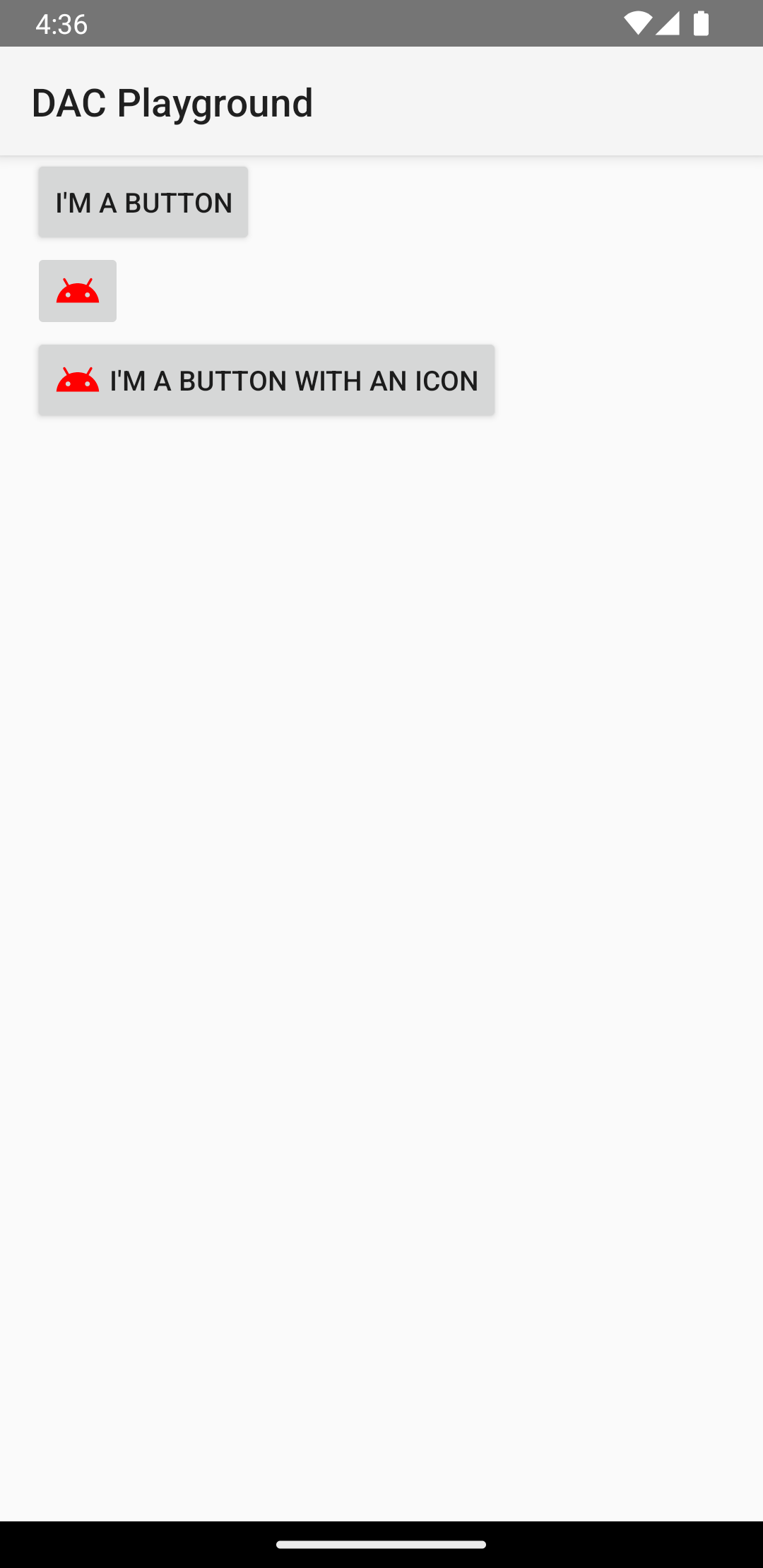
  <LinearLayout xmlns:android="http://schemas.android.com/apk/res/android"
      xmlns:app="http://schemas.android.com/apk/res-auto"
      android:layout_width="match_parent"
      android:layout_height="match_parent"
      android:paddingLeft="16dp"
      android:paddingRight="16dp"
      android:orientation="vertical" >

      <Button
          android:id="@+id/supabutton"
          android:layout_width="wrap_content"
          android:layout_height="wrap_content"
          android:text="I'm a button" />

      <ImageButton
          android:layout_width="wrap_content"
          android:layout_height="wrap_content"
          android:contentDescription="A tiny Android icon"
          android:src="@drawable/baseline_android_24"
          app:tint="#ff0000" />

      <Button
          android:layout_width="wrap_content"
          android:layout_height="wrap_content"
          android:drawableStart="@drawable/baseline_android_24"
          android:drawablePadding="4dp"
          android:drawableTint="#ff0000"
          android:text="I'm a button with an icon" />
  </LinearLayout>
上面的代码生成的效果类似这样
响应点击事件
当用户点按按钮时,Button 对象会收到 on-click 事件。
若要以编程方式声明事件处理程序,请创建一个 View.OnClickListener 对象,并通过调用 setOnClickListener(View.OnClickListener) 将其分配给按钮,如下例所示
Kotlin
findViewById<Button>(R.id.supabutton)
  .setOnClickListener {
      Log.d("BUTTONS", "User tapped the Supabutton")
  }
Java
Button button = (Button) findViewById(R.id.supabutton);
button.setOnClickListener(new View.OnClickListener() {
    public void onClick(View v) {
      Log.d("BUTTONS", "User tapped the Supabutton");
    }
});
为按钮设置样式
按钮的外观(背景图片和字体)因设备而异,因为不同制造商的设备通常对输入控件有不同的默认样式。
如需为单个按钮自定义背景,请使用 drawable 或 color 资源指定 android:background 属性。此外,您还可以为按钮应用一种样式,其工作方式类似于 HTML 样式,用于定义背景、字体和大小等多种样式属性。如需详细了解如何应用样式,请参阅样式和主题背景。
无边框按钮
一种实用的设计是“无边框”按钮。无边框按钮类似于基本按钮,不同之处在于它们没有边框或背景,但在不同状态下(例如被点按时)仍会改变外观。
如需创建无边框按钮,请将 borderlessButtonStyle 样式应用于按钮,如下例所示
<Button
  android:id="@+id/supabutton"
  style="?android:attr/borderlessButtonStyle"
  android:layout_width="wrap_content"
  android:layout_height="wrap_content"
  android:text="I'm a button" />
自定义背景
如果您想真正重新定义按钮的外观,可以指定自定义背景。不过,您的背景必须是状态列表资源,它会根据按钮的当前状态改变外观,而不是提供简单的位图或颜色。
您可以在 XML 文件中定义状态列表,该文件定义了用于不同按钮状态的三张图片或颜色。
如需为按钮背景创建状态列表 drawable,请执行以下操作
- 为按钮背景创建三个位图,分别代表默认、点按和获得焦点状态。为了确保图片适合不同大小的按钮,请将位图创建为九宫格图。
- 将位图放入项目的
res/drawable/目录中。为每个位图命名,以反映它所代表的按钮状态,例如button_default.9.png、button_pressed.9.png和button_focused.9.png。 - 在
res/drawable/目录中创建一个新的 XML 文件。将其命名为button_custom.xml。插入如下所示的 XML<?xml version="1.0" encoding="utf-8"?> <selector xmlns:android="http://schemas.android.com/apk/res/android"> <item android:drawable="@drawable/button_pressed" android:state_pressed="true" /> <item android:drawable="@drawable/button_focused" android:state_focused="true" /> <item android:drawable="@drawable/button_default" /> </selector>
这定义了一个 drawable 资源,它会根据按钮的当前状态改变其图片。
- 第一个
<item>定义了当按钮被点按(激活)时使用的位图。 - 第二个
<item>定义了当按钮获得焦点(例如使用轨迹球或方向键突出显示按钮时)时使用的位图。 - 第三个
<item>定义了当按钮处于默认状态(既未被点按也未获得焦点)时使用的位图。
此 XML 文件表示单个 drawable 资源。当
Button引用它作为背景时,显示的图片会根据按钮的状态而改变。 - 第一个
- 将 drawable XML 文件应用于按钮背景
<Button
    android:id="@+id/button_send"
    android:layout_width="wrap_content"
    android:layout_height="wrap_content"
    android:text="@string/button_send"
    android:onClick="sendMessage"
    android:background="@drawable/button_custom"  />
如需详细了解此 XML 语法(包括如何定义禁用、悬停或处于其他状态的按钮),请阅读 StateListDrawable。