
窗口尺寸类别是一组有指导意义的视口断点,可帮助您设计、开发和测试响应式/自适应布局。这些断点在布局的简单性与针对独特情况优化应用的灵活性之间取得平衡。
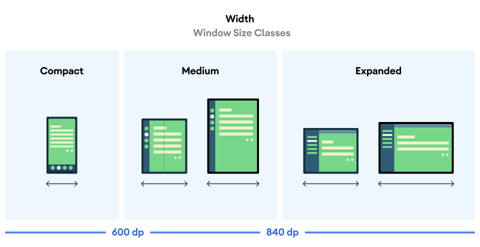
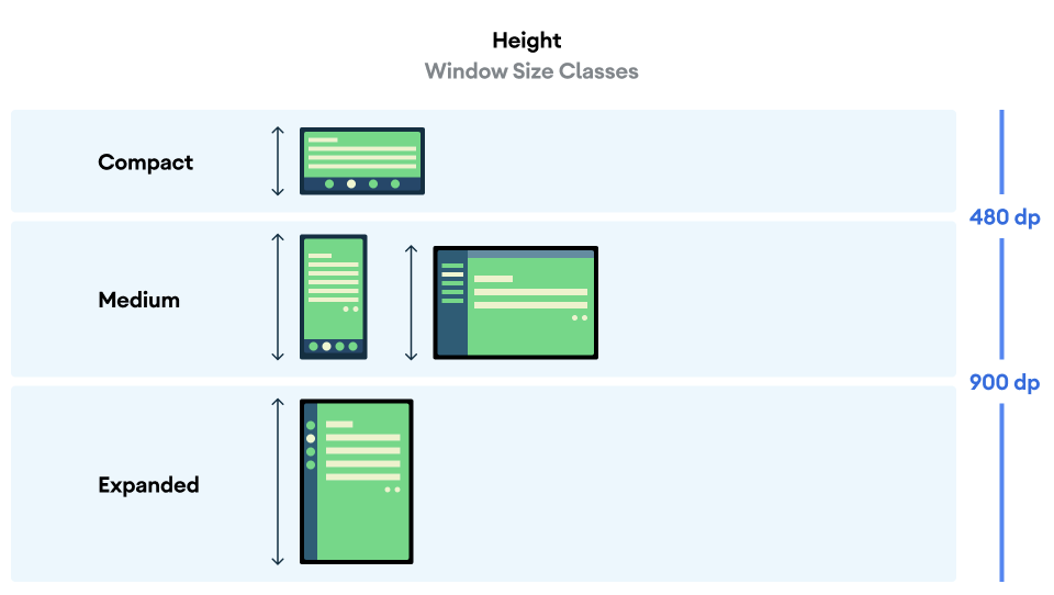
窗口尺寸类别将应用可用的显示区域分为紧凑 (compact)、中等 (medium)、展开 (expanded)、大 (large) 或超大 (extra large)。可用宽度和高度分别分类,因此在任何时间点,您的应用都有两个窗口尺寸类别 - 一个用于宽度,一个用于高度。由于普遍存在的垂直滚动,可用宽度通常比可用高度更重要,因此宽度窗口尺寸类别可能与您应用的 UI 更相关。
如图所示,这些断点允许您继续从设备和配置的角度思考布局。每个尺寸类别断点都代表典型设备场景下的多数情况,这在您思考基于断点的布局设计时可以作为有用的参考框架。
| 尺寸类别 | 断点 | 设备表示 |
|---|---|---|
| 紧凑宽度 | 宽度 < 600dp | 99.96% 的竖屏手机 |
| 中等宽度 | 600dp ≤ 宽度 < 840dp | 93.73% 的竖屏平板电脑, 大多数大型折叠内部屏幕在竖屏时 |
| 展开宽度 | 840dp ≤ 宽度 < 1200dp | 97.22% 的横屏平板电脑, 大多数大型折叠内部屏幕在横屏时至少为展开宽度 |
| 大宽度 | 1200dp ≤ 宽度 < 1600dp | 大型平板电脑屏幕 |
| 超大宽度 | 宽度 ≥ 1600dp | 桌面显示器 |
| 紧凑高度 | 高度 < 480dp | 99.78% 的横屏手机 |
| 中等高度 | 480dp ≤ 高度 < 900dp | 96.56% 的横屏平板电脑, 97.59% 的竖屏手机 |
| 展开高度 | 高度 ≥ 900dp | 94.25% 的竖屏平板电脑 |
尽管将尺寸类别可视化为物理设备可能有用,但窗口尺寸类别并非明确由设备屏幕尺寸决定。窗口尺寸类别不适用于 isTablet 类型的逻辑。相反,窗口尺寸类别是由应用程序可用的窗口大小决定的,无论应用在哪种类型的设备上运行,这有两层重要含义:
物理设备不能保证特定的窗口尺寸类别。 由于多种原因,应用可用的屏幕空间可能与设备的屏幕尺寸不同。在移动设备上,分屏模式可以将屏幕分割给两个应用程序。在 ChromeOS 上,Android 应用可以在桌面类型的窗口中呈现,这些窗口可任意调整大小。折叠设备可以通过折叠或展开来单独访问两个不同尺寸的屏幕。
窗口尺寸类别可以在应用的生命周期内发生变化。 当应用运行时,设备方向变化、多任务处理以及折叠/展开设备会改变可用的屏幕空间量。因此,窗口尺寸类别是动态的,您的应用 UI 应相应地进行调整。
窗口尺寸类别映射到 Material Design 布局指南 中的紧凑、中等和展开断点。使用窗口尺寸类别来做出高层次的应用布局决策,例如决定是否使用特定的规范布局以利用额外的屏幕空间。
您可以使用 Jetpack WindowManager 库提供的 WindowSizeClass#compute() 函数计算当前的 WindowSizeClass。以下示例显示了如何计算窗口尺寸类别并在窗口尺寸类别更改时接收更新:
Kotlin
class MainActivity : Activity() {
    override fun onCreate(savedInstanceState: Bundle?) {
        super.onCreate(savedInstanceState)

        // ...

        // Replace with a known container that you can safely add a
        // view to where the view won't affect the layout and the view
        // won't be replaced.
        val container: ViewGroup = binding.container

        // Add a utility view to the container to hook into
        // View.onConfigurationChanged(). This is required for all
        // activities, even those that don't handle configuration
        // changes. You can't use Activity.onConfigurationChanged(),
        // since there are situations where that won't be called when
        // the configuration changes. View.onConfigurationChanged() is
        // called in those scenarios.
        container.addView(object : View(this) {
            override fun onConfigurationChanged(newConfig: Configuration?) {
                super.onConfigurationChanged(newConfig)
                computeWindowSizeClasses()
            }
        })

        computeWindowSizeClasses()
    }

    private fun computeWindowSizeClasses() {
        val metrics = WindowMetricsCalculator.getOrCreate().computeCurrentWindowMetrics(this)
        val width = metrics.bounds.width()
        val height = metrics.bounds.height()
        val density = resources.displayMetrics.density
        val windowSizeClass = WindowSizeClass.compute(width/density, height/density)
        // COMPACT, MEDIUM, or EXPANDED
        val widthWindowSizeClass = windowSizeClass.windowWidthSizeClass
        // COMPACT, MEDIUM, or EXPANDED
        val heightWindowSizeClass = windowSizeClass.windowHeightSizeClass

        // Use widthWindowSizeClass and heightWindowSizeClass.
    }
}
Java
public class MainActivity extends Activity {
    @Override
    protected void onCreate(Bundle savedInstanceState) {
        super.onCreate(savedInstanceState);

        // ...

        // Replace with a known container that you can safely add a
        // view to where the view won't affect the layout and the view
        // won't be replaced.
        ViewGroup container = binding.container;

        // Add a utility view to the container to hook into
        // View.onConfigurationChanged(). This is required for all
        // activities, even those that don't handle configuration
        // changes. You can't use Activity.onConfigurationChanged(),
        // since there are situations where that won't be called when
        // the configuration changes. View.onConfigurationChanged() is
        // called in those scenarios.
        container.addView(new View(this) {
            @Override
            protected void onConfigurationChanged(Configuration newConfig) {
                super.onConfigurationChanged(newConfig);
                computeWindowSizeClasses();
            }
        });

        computeWindowSizeClasses();
    }

    private void computeWindowSizeClasses() {
        WindowMetrics metrics = WindowMetricsCalculator.getOrCreate()
                .computeCurrentWindowMetrics(this);

        int width = metrics.getBounds().width();
        int height = metrics.getBounds().height();
        float density = getResources().getDisplayMetrics().density;
        WindowSizeClass windowSizeClass = WindowSizeClass.compute(width/density, height/density);
        // COMPACT, MEDIUM, or EXPANDED
        WindowWidthSizeClass widthWindowSizeClass = windowSizeClass.getWindowWidthSizeClass();
        // COMPACT, MEDIUM, or EXPANDED
        WindowHeightSizeClass heightWindowSizeClass = windowSizeClass.getWindowHeightSizeClass();

        // Use widthWindowSizeClass and heightWindowSizeClass.
    }
}
测试窗口尺寸类别
进行布局更改时,请测试布局在所有窗口大小上的行为,尤其是紧凑、中等和展开断点宽度。
如果您已经有针对紧凑屏幕的布局,请首先针对展开宽度尺寸类别优化您的布局,因为此尺寸类别提供了最多空间用于额外内容和 UI 更改。然后决定哪种布局适用于中等宽度尺寸类别;考虑添加专门的布局。
后续步骤
要了解如何使用窗口尺寸类别创建响应式/自适应布局的更多信息,请参阅以下内容:
对于基于 Compose 的布局:支持不同的显示尺寸
对于基于视图的布局:使用视图实现响应式/自适应设计
要了解关于如何在所有设备和屏幕尺寸上使应用表现出色的更多信息,请参阅: