
此页面提供了 Android 12(API 级别 31)及更高版本中可用的可选微件增强功能的详细信息。这些功能是可选的,但易于实现,并且可以改善用户的微件体验。
使用动态颜色
从 Android 12 开始,微件可以使用设备主题颜色作为按钮、背景和其他组件的颜色。这可以在不同微件之间提供更平滑的过渡和一致性。
实现动态颜色有两种方法
在根布局中使用系统的默认主题 (
@android:style/Theme.DeviceDefault.DayNight)。使用 Material Components for Android 库中的 Material 3 主题 (
Theme.Material3.DynamicColors.DayNight),该主题从 Material Components for Android v1.6.0 开始提供。
在根布局中设置主题后,您可以在根或其任何子项中使用常见的颜色属性来获取动态颜色。
您可以使用的颜色属性示例如下:
?attr/primary?attr/primaryContainer?attr/onPrimary?attr/onPrimaryContainer
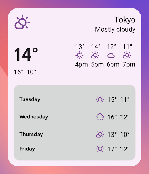
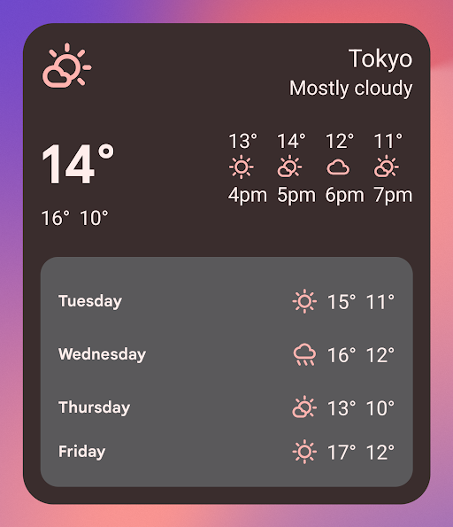
在使用 Material 3 主题的以下示例中,设备的深色主题颜色是“紫罗兰色”。辅助色和微件背景会根据浅色模式和深色模式进行调整,如图 1 和图 2 所示。
<LinearLayout xmlns:android="http://schemas.android.com/apk/res/android"
  xmlns:app="http://schemas.android.com/apk/res-auto"
  android:layout_width="match_parent"
  android:layout_height="match_parent"
  android:background="?attr/colorPrimaryContainer"
  android:theme="@style/Theme.Material3.DynamicColors.DayNight">

  <ImageView
    ...
    app:tint="?attr/colorPrimaryContainer"
    android:src="@drawable/ic_partly_cloudy" />

    <!-- Other widget content. -->

</LinearLayout>
动态颜色的向后兼容性
动态颜色仅适用于运行 Android 12 或更高版本的设备。要为较低版本提供自定义主题,请使用默认主题属性创建具有自定义颜色和新限定符 (values-v31) 的默认主题。
以下是使用 Material 3 主题的示例:
/values/styles.xml
<resources>
  <style name="MyWidgetTheme" parent="Theme.Material3.DynamicColors.DayNight">
    <!-- Override default colorBackground attribute with custom color. -->
    <item name="android:colorBackground">@color/my_background_color</item>

    <!-- Add other colors/attributes. -->

  </style>
</resources>
/values-v31/styles.xml
<resources>
  <!-- Do not override any color attribute. -->
  <style name="MyWidgetTheme" parent="Theme.Material3.DynamicColors.DayNight" />
</resources>
/layout/my_widget_layout.xml
<resources>
  <LinearLayout xmlns:android="http://schemas.android.com/apk/res/android"
    ...
    android:background="?android:attr/colorBackground"
    android:theme="@style/MyWidgetTheme" />
</resources>
启用语音支持
应用操作可让 Google 助理根据相关的用户语音命令显示微件。通过配置您的微件以响应内置 intent (BII),您的应用可以在 Android 和 Android Auto 等 Assistant Surface 上主动显示微件。用户可以选择将 Assistant 显示的微件固定到其启动器,以鼓励未来的互动。
例如,您可以配置锻炼应用中的锻炼摘要微件,以执行触发 GET_EXERCISE_OBSERVATION BII 的用户语音命令。当用户通过发出如下请求触发此 BII 时,Assistant 会主动显示您的微件:“Hey Google,我这周在 ExampleApp 上跑了多少英里?”
有数十种 BII 涵盖了多种类别的用户互动,几乎任何 Android 应用都可以为其微件增强语音功能。要开始使用,请参阅将应用操作与 Android 微件集成。
改善应用微件选择器的体验
Android 12 可让您添加缩放的微件预览和微件说明。Android 15 可让您通过生成的微件预览来改善应用微件选择器的体验。
为了改善应用微件选择器的体验,请在 Android 15 及更高版本的设备上提供生成的微件预览,在 Android 12 到 Android 14 设备上提供缩放微件预览(通过指定 previewLayout),并在更早版本上提供 previewImage。
向微件选择器添加生成的微件预览
应用必须在模块 build.gradle 文件中将 compileSdk 值设置为 35 或更高版本,以便能够在 Android 15 或更高版本的设备上向微件选择器提供 RemoteViews。这意味着应用可以更新选择器中的内容,使其更具代表性,更符合用户看到的内容。
应用可以使用 AppWidgetManager、setWidgetPreview 和 getWidgetPreview 方法使用最新且个性化的信息更新微件的外观。
使用 Jetpack Glance 生成更新的预览
Glance.compose 运行一个 composition,因此在其可组合项的主体中不使用 suspend 函数、流或类似的异步调用。相反,您必须使用常量数据。
以下示例使用 Jetpack Glance 生成更新的预览。此代码段中的 setWidgetPreview 方法需要 compileSdk 构建设置的值为 35 或更高版本。
AppWidgetManager.getInstance(appContext).setWidgetPreview(
ComponentName(
appContext,
ExampleAppWidgetReceiver::class.java
),
AppWidgetProviderInfo.WIDGET_CATEGORY_HOME_SCREEN,
ExampleAppWidget().compose(
context = appContext
),
)
不使用 Jetpack Glance 生成更新的预览
您可以在不使用 Glance 的情况下使用 RemoteViews。以下示例加载 XML 微件布局资源并将其设置为预览。此代码段中的 setWidgetPreview 方法需要 compileSdk 构建设置的值为 35 或更高版本。
AppWidgetManager.getInstance(appContext).setWidgetPreview(
ComponentName(
appContext,
ExampleAppWidgetReceiver::class.java
),
AppWidgetProviderInfo.WIDGET_CATEGORY_HOME_SCREEN,
RemoteViews("com.example", R.layout.widget_preview)
)
向微件选择器添加可缩放微件预览
从 Android 12 开始,微件选择器中显示的微件预览是可缩放的。您将其作为设置为微件默认大小的 XML 布局提供。以前,微件预览是一个静态可绘制资源,在某些情况下会导致预览无法准确反映微件添加到主屏幕时的外观。
要实现可缩放微件预览,请使用 appwidget-provider 元素的 previewLayout 属性来提供 XML 布局:
<appwidget-provider
    android:previewLayout="@layout/my_widget_preview">
</appwidget-provider>
我们建议使用与实际微件相同的布局,并使用真实的默认值或测试值。大多数应用使用相同的 previewLayout 和 initialLayout。有关创建准确预览布局的指南,请参阅此页面中的以下部分。
我们建议同时指定 previewLayout 和 previewImage 属性,这样如果用户的设备不支持 previewLayout,您的应用可以回退到使用 previewImage。previewLayout 属性优先于 previewImage 属性。
构建准确预览的推荐方法
要实现可缩放微件预览,请使用 appwidget-provider 元素的 previewLayout 属性提供 XML 布局
<appwidget-provider
    ...
    android:previewLayout="@layout/my_widget_preview">
</appwidget-provider>
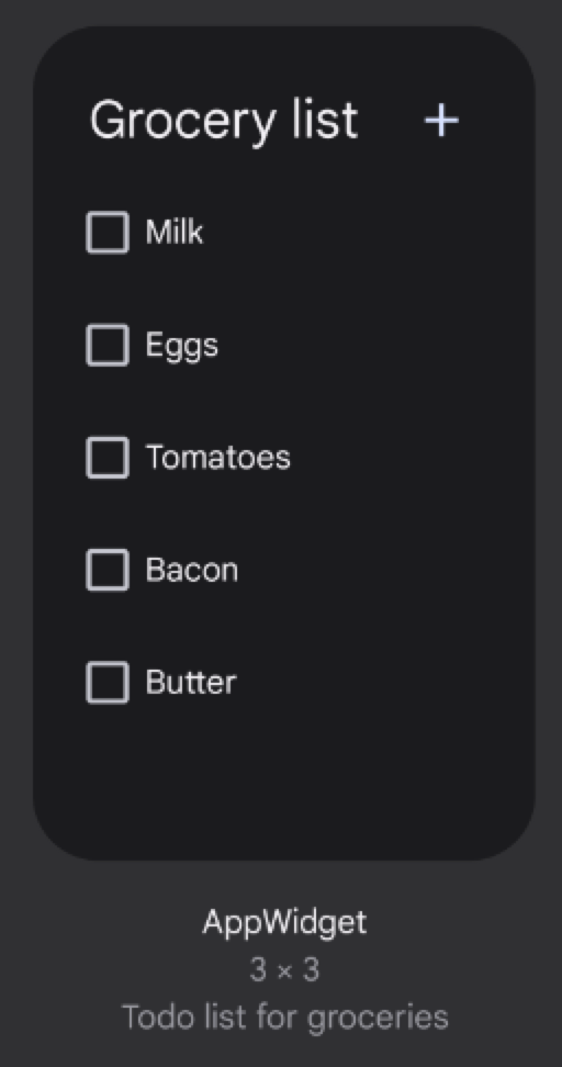
为了显示准确的预览,您可以通过完成以下步骤直接提供具有默认值的实际微件布局
为
TextView元素设置android:text="@string/my_widget_item_fake_1"。为
ImageView组件设置默认或占位符图片或图标,例如android:src="@drawable/my_widget_icon"。
如果没有默认值,预览可能会显示不正确或空值。这种方法的一个重要好处是您可以提供本地化的预览内容。
对于包含 ListView、GridView 或 StackView 的更复杂预览的推荐方法,请参阅构建包含动态项的准确预览了解详细信息。
可缩放微件预览的向后兼容性
为了让 Android 11(API 级别 30)或更低版本上的微件选择器显示您的微件预览,请指定 previewImage 属性。
如果您更改了微件的外观,请更新预览图片。
为您的微件添加名称
微件在微件选择器中显示时需要具有唯一的名称。
微件的名称是从 AndroidManifest.xml 文件中微件的 receiver 元素的 label 属性加载的。
<receiver
    ….
   android:label="Memories">
     ….
</receiver>
为您的微件添加说明
从 Android 12 开始,请提供微件选择器要为您的微件显示的说明。
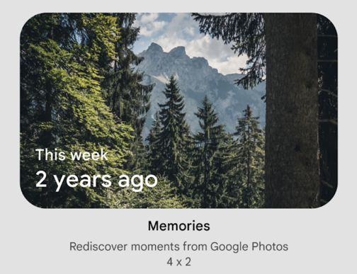
使用 <appwidget-provider> 元素的 description 属性为您的微件提供说明
<appwidget-provider
    android:description="@string/my_widget_description">
</appwidget-provider>
您可以在 Android 的先前版本上使用 descriptionRes 属性,但微件选择器会忽略它。
启用更流畅的过渡
从 Android 12 开始,当用户从微件启动您的应用时,启动器会提供更流畅的过渡效果。
要启用此改进的过渡效果,请使用 @android:id/background 或 android.R.id.background 来标识您的背景元素
// Top-level layout of the widget.
<LinearLayout
    android:id="@android:id/background">
</LinearLayout>
您的应用可以在以前的 Android 版本上使用 @android:id/background 而不会出错,但会被忽略。
使用 RemoteViews 的运行时修改
从 Android 12 开始,您可以利用多个 RemoteViews 方法来实现 RemoteViews 属性的运行时修改。有关添加方法的完整列表,请参阅 RemoteViews API 参考。
以下代码示例展示了如何使用其中的一些方法。
Kotlin
// Set the colors of a progress bar at runtime.
remoteView.setColorStateList(R.id.progress, "setProgressTintList", createProgressColorStateList())

// Specify exact sizes for margins.
remoteView.setViewLayoutMargin(R.id.text, RemoteViews.MARGIN_END, 8f, TypedValue.COMPLEX_UNIT_DP)
Java
// Set the colors of a progress bar at runtime.
remoteView.setColorStateList(R.id.progress, "setProgressTintList", createProgressColorStateList());

// Specify exact sizes for margins.
remoteView.setViewLayoutMargin(R.id.text, RemoteViews.MARGIN_END, 8f, TypedValue.COMPLEX_UNIT_DP);