
滚动修饰符
verticalScroll 和 horizontalScroll 修饰符提供了最简单的方式,当其内容边界大于其最大尺寸约束时,允许用户滚动元素。使用 verticalScroll 和 horizontalScroll 修饰符,您无需平移或偏移内容。
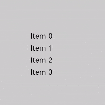
@Composable private fun ScrollBoxes() { Column( modifier = Modifier .background(Color.LightGray) .size(100.dp) .verticalScroll(rememberScrollState()) ) { repeat(10) { Text("Item $it", modifier = Modifier.padding(2.dp)) } } }
ScrollState 允许您更改滚动位置或获取其当前状态。要使用默认参数创建它,请使用 rememberScrollState()。
@Composable private fun ScrollBoxesSmooth() { // Smoothly scroll 100px on first composition val state = rememberScrollState() LaunchedEffect(Unit) { state.animateScrollTo(100) } Column( modifier = Modifier .background(Color.LightGray) .size(100.dp) .padding(horizontal = 8.dp) .verticalScroll(state) ) { repeat(10) { Text("Item $it", modifier = Modifier.padding(2.dp)) } } }
可滚动修饰符
scrollable 修饰符与滚动修饰符不同之处在于,scrollable 检测滚动手势并捕获增量,但不会自动偏移其内容。这而是通过 ScrollableState 委托给用户,这是此修饰符正常工作所必需的。
构建 ScrollableState 时,您必须提供一个 consumeScrollDelta 函数,该函数将在每个滚动步骤(通过手势输入、平滑滚动或滑动)以像素增量调用。此函数必须返回已消耗的滚动距离,以确保在存在具有 scrollable 修饰符的嵌套元素时事件正确传播。
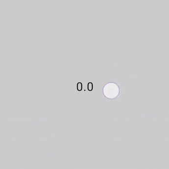
以下代码片段检测手势并显示偏移量的数值,但不偏移任何元素
@Composable private fun ScrollableSample() { // actual composable state var offset by remember { mutableStateOf(0f) } Box( Modifier .size(150.dp) .scrollable( orientation = Orientation.Vertical, // Scrollable state: describes how to consume // scrolling delta and update offset state = rememberScrollableState { delta -> offset += delta delta } ) .background(Color.LightGray), contentAlignment = Alignment.Center ) { Text(offset.toString()) } }
嵌套滚动
嵌套滚动是一个系统,其中包含在彼此内部的多个滚动组件通过对单个滚动手势做出反应并通信其滚动增量(变化)来协同工作。
嵌套滚动系统允许滚动组件和层次结构链接(通常通过共享同一个父级)的组件之间进行协调。此系统链接滚动容器并允许与正在传播和共享的滚动增量进行交互。
Compose 提供了多种处理可组合项之间嵌套滚动的方式。嵌套滚动的典型示例是列表中的另一个列表,更复杂的例子是可折叠工具栏。
自动嵌套滚动
简单的嵌套滚动无需您采取任何行动。启动滚动操作的手势会自动从子级传播到父级,这样当子级无法再滚动时,手势会由其父元素处理。
Compose 的某些组件和修饰符原生支持并提供自动嵌套滚动:verticalScroll、horizontalScroll、scrollable、Lazy API 和 TextField。这意味着当用户滚动嵌套组件的内部子级时,之前的修饰符会将滚动增量传播到具有嵌套滚动支持的父级。
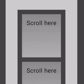
以下示例显示了将 verticalScroll 修饰符应用于其内部的元素,而容器本身也应用了 verticalScroll 修饰符。
@Composable private fun AutomaticNestedScroll() { val gradient = Brush.verticalGradient(0f to Color.Gray, 1000f to Color.White) Box( modifier = Modifier .background(Color.LightGray) .verticalScroll(rememberScrollState()) .padding(32.dp) ) { Column { repeat(6) { Box( modifier = Modifier .height(128.dp) .verticalScroll(rememberScrollState()) ) { Text( "Scroll here", modifier = Modifier .border(12.dp, Color.DarkGray) .background(brush = gradient) .padding(24.dp) .height(150.dp) ) } } } } }
使用 nestedScroll 修饰符
如果您需要创建多个元素之间的高级协调滚动,nestedScroll 修饰符通过定义嵌套滚动层次结构为您提供了更大的灵活性。如上一节所述,某些组件具有内置的嵌套滚动支持。但是,对于不自动滚动的可组合项,例如 Box 或 Column,此类组件上的滚动增量不会在嵌套滚动系统中传播,并且增量不会到达 NestedScrollConnection 或父组件。要解决此问题,您可以使用 nestedScroll 为其他组件(包括自定义组件)提供此类支持。
嵌套滚动周期
嵌套滚动周期是指通过所有属于嵌套滚动系统的组件(或节点)在层次结构树中上下分发的滚动增量流,例如通过使用可滚动组件和修饰符,或 nestedScroll。
嵌套滚动周期的阶段
当可滚动组件检测到触发事件(例如,手势)时,在实际滚动操作触发之前,生成的增量会发送到嵌套滚动系统并经历三个阶段:预滚动、节点消耗和后滚动。
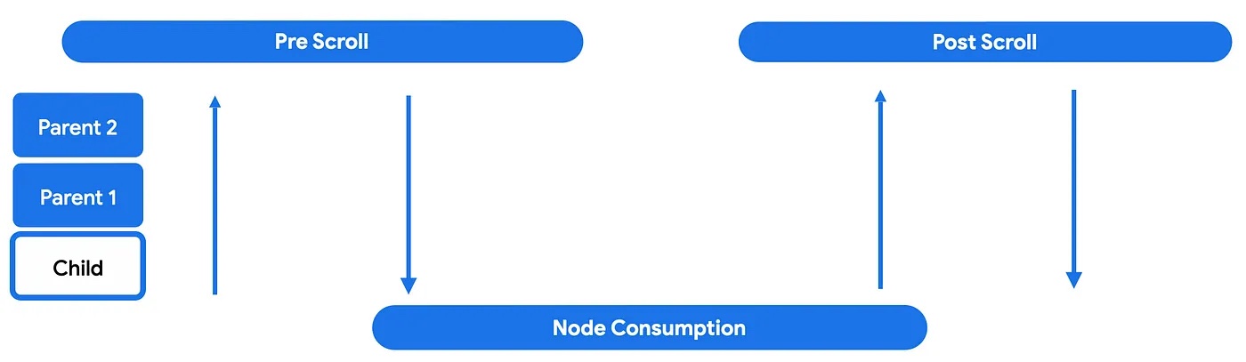
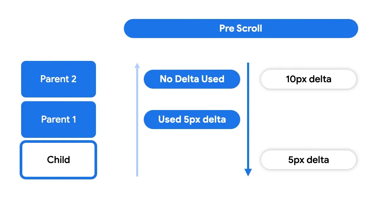
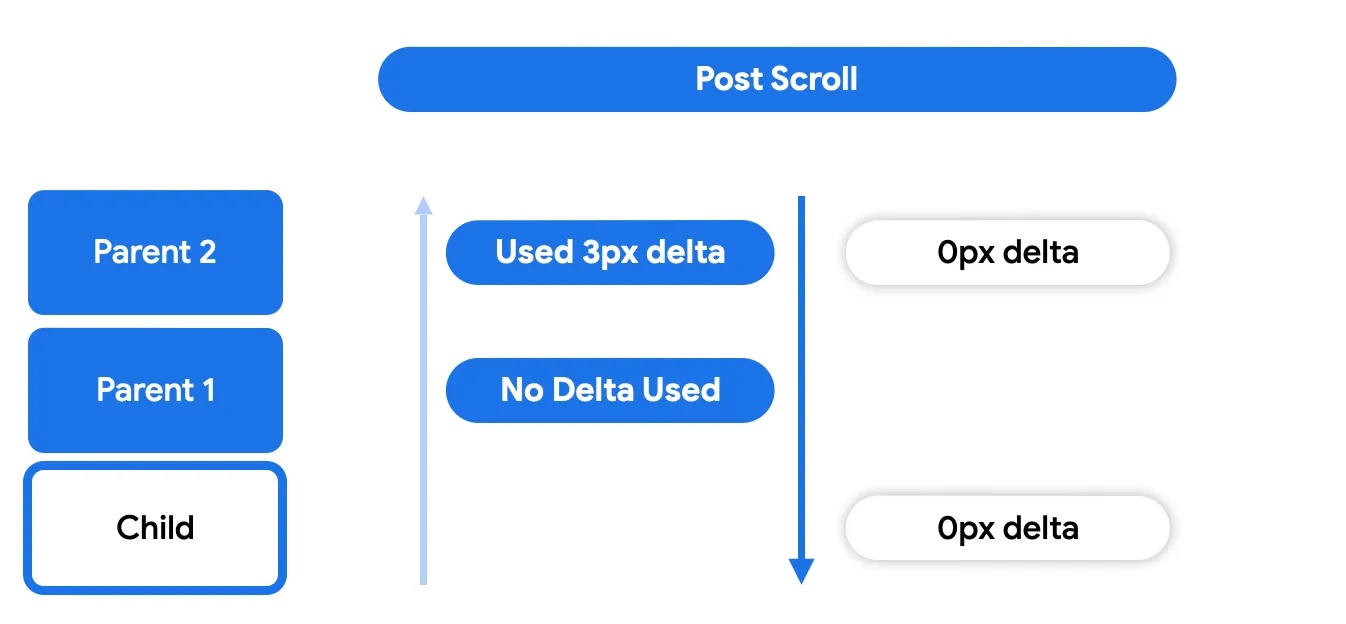
在第一个预滚动阶段,接收到触发事件增量的组件会将这些事件向上分发,通过层次结构树,直到最顶层的父级。然后,增量事件将向下冒泡,这意味着增量将从最根部的父级向下传播到启动嵌套滚动周期的子级。
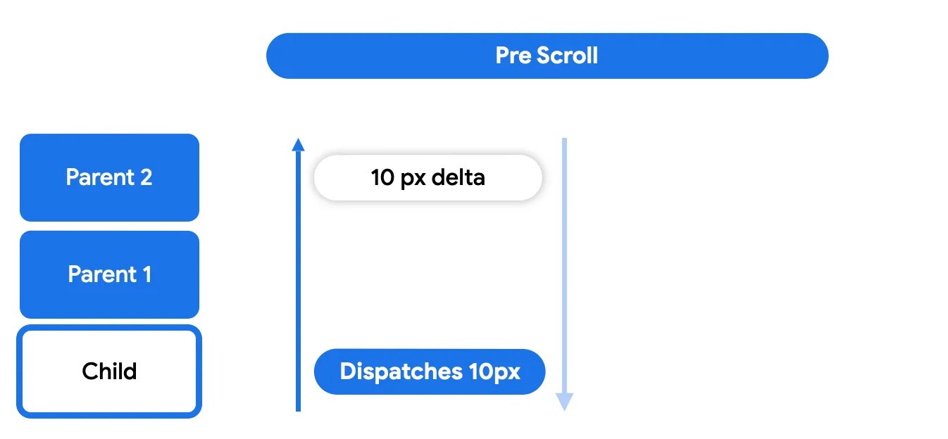
这使得嵌套滚动父级(使用 nestedScroll 或可滚动修饰符的可组合项)有机会在节点本身消耗增量之前对其进行处理。
在节点消耗阶段,节点本身将使用其父级未使用的任何增量。这是实际进行滚动移动并可见的时候。
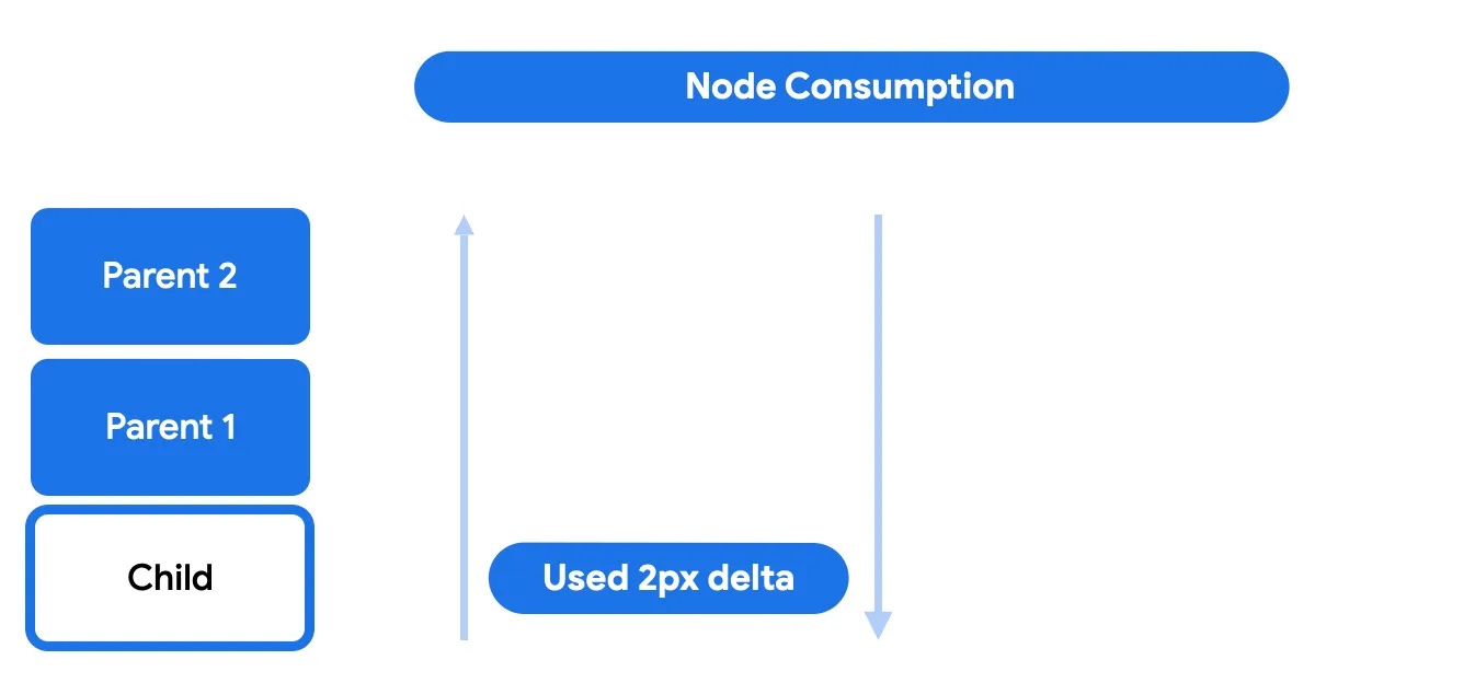
在此阶段,子级可以选择消耗剩余滚动量的全部或部分。剩余的任何内容都将发送回上级以进行后滚动阶段。
最后,在后滚动阶段,节点本身未消耗的任何内容都将再次发送给其祖先以供消耗。
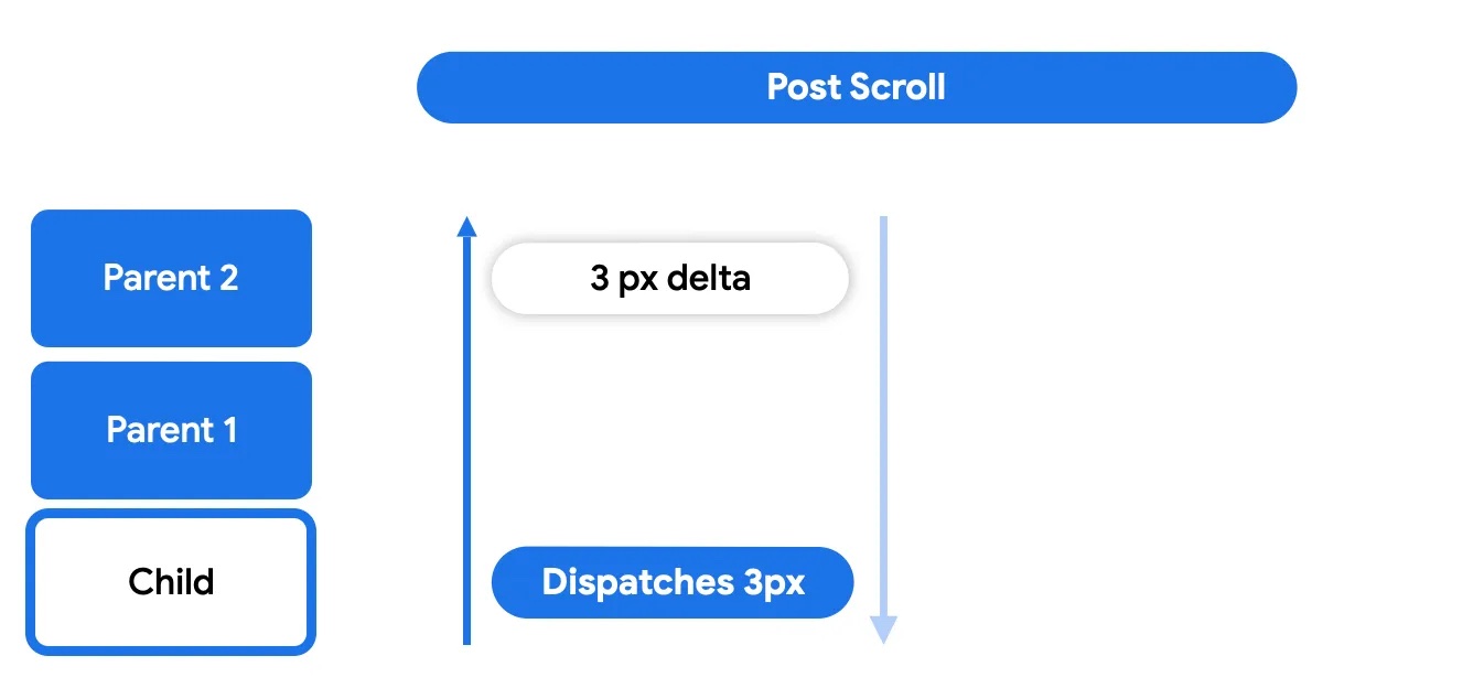
后滚动阶段的工作方式与预滚动阶段类似,其中任何父级都可以选择是否消耗。
与滚动类似,当拖动手势完成时,用户的意图可能会转化为用于滑动(使用动画滚动)可滚动容器的速度。滑动也是嵌套滚动周期的一部分,拖动事件生成的速度也会经历类似的阶段:预滑动、节点消耗和后滑动。请注意,滑动动画仅与触摸手势相关联,不会由其他事件触发,例如辅助功能或硬件滚动。
参与嵌套滚动周期
参与周期意味着在层次结构中拦截、消耗和报告增量的消耗。Compose 提供了一组工具来影响嵌套滚动系统的工作方式以及如何直接与其交互,例如当您需要在可滚动组件甚至开始滚动之前处理滚动增量时。
如果嵌套滚动周期是作用于节点链上的系统,那么 nestedScroll 修饰符是一种拦截和插入这些更改并影响在链中传播的数据(滚动增量)的方式。此修饰符可以放置在层次结构中的任何位置,它会与树上的嵌套滚动修饰符实例进行通信,以便通过此通道共享信息。此修饰符的构建块是 NestedScrollConnection 和 NestedScrollDispatcher。
NestedScrollConnection 提供了一种响应嵌套滚动周期阶段并影响嵌套滚动系统的方式。它由四个回调方法组成,每个方法代表一个消耗阶段:预/后滚动和预/后滑动
val nestedScrollConnection = object : NestedScrollConnection { override fun onPreScroll(available: Offset, source: NestedScrollSource): Offset { println("Received onPreScroll callback.") return Offset.Zero } override fun onPostScroll( consumed: Offset, available: Offset, source: NestedScrollSource ): Offset { println("Received onPostScroll callback.") return Offset.Zero } }
每个回调还提供有关正在传播的增量的信息:该特定阶段的 available 增量,以及前一个阶段消耗的 consumed 增量。如果在任何时候您想停止向上层次结构传播增量,您可以使用嵌套滚动连接来完成此操作
val disabledNestedScrollConnection = remember { object : NestedScrollConnection { override fun onPostScroll( consumed: Offset, available: Offset, source: NestedScrollSource ): Offset { return if (source == NestedScrollSource.SideEffect) { available } else { Offset.Zero } } } }
所有回调都提供有关 NestedScrollSource 类型的信息。
NestedScrollDispatcher 初始化嵌套滚动周期。使用调度程序并调用其方法会触发周期。可滚动容器具有内置调度程序,可将手势捕获的增量发送到系统。因此,大多数自定义嵌套滚动的用例涉及使用 NestedScrollConnection 而不是调度程序,以对已存在的增量做出反应而不是发送新的增量。有关更多用法,请参阅 NestedScrollDispatcherSample。
在滚动时调整图像大小
当用户滚动时,您可以创建动态视觉效果,图像会根据滚动位置改变大小。
根据滚动位置调整图像大小
此代码段演示了在 LazyColumn 中根据垂直滚动位置调整图像大小。当用户向下滚动时图像会缩小,向上滚动时会放大,并保持在定义的最小和最大尺寸边界内
@Composable fun ImageResizeOnScrollExample( modifier: Modifier = Modifier, maxImageSize: Dp = 300.dp, minImageSize: Dp = 100.dp ) { var currentImageSize by remember { mutableStateOf(maxImageSize) } var imageScale by remember { mutableFloatStateOf(1f) } val nestedScrollConnection = remember { object : NestedScrollConnection { override fun onPreScroll(available: Offset, source: NestedScrollSource): Offset { // Calculate the change in image size based on scroll delta val delta = available.y val newImageSize = currentImageSize + delta.dp val previousImageSize = currentImageSize // Constrain the image size within the allowed bounds currentImageSize = newImageSize.coerceIn(minImageSize, maxImageSize) val consumed = currentImageSize - previousImageSize // Calculate the scale for the image imageScale = currentImageSize / maxImageSize // Return the consumed scroll amount return Offset(0f, consumed.value) } } } Box(Modifier.nestedScroll(nestedScrollConnection)) { LazyColumn( Modifier .fillMaxWidth() .padding(15.dp) .offset { IntOffset(0, currentImageSize.roundToPx()) } ) { // Placeholder list items items(100, key = { it }) { Text( text = "Item: $it", style = MaterialTheme.typography.bodyLarge ) } } Image( painter = ColorPainter(Color.Red), contentDescription = "Red color image", Modifier .size(maxImageSize) .align(Alignment.TopCenter) .graphicsLayer { scaleX = imageScale scaleY = imageScale // Center the image vertically as it scales translationY = -(maxImageSize.toPx() - currentImageSize.toPx()) / 2f } ) } }
代码要点
- 此代码使用
NestedScrollConnection来拦截滚动事件。 onPreScroll根据滚动增量计算图像大小的变化。currentImageSize状态变量存储图像的当前大小,其受限于minImageSize和maxImageSize。imageScale源自currentImageSize。LazyColumn根据currentImageSize进行偏移。Image使用graphicsLayer修饰符应用计算出的比例。graphicsLayer中的translationY确保图像在缩放时垂直居中。
结果
上述代码片段会在滚动时产生图像缩放效果
嵌套滚动互操作
当您尝试在可滚动可组合项中嵌套可滚动 View 元素,或反之亦然时,可能会遇到问题。最明显的问题是当您滚动子级并达到其起始或结束边界时,期望父级接管滚动。然而,这种预期行为可能不会发生或可能无法按预期工作。
此问题源于可滚动可组合项中内置的预期。可滚动可组合项有一个“默认嵌套滚动”规则,这意味着任何可滚动容器都必须参与嵌套滚动链,既作为父级通过 NestedScrollConnection,也作为子级通过 NestedScrollDispatcher。当子级达到边界时,子级将为父级驱动嵌套滚动。例如,此规则允许 Compose Pager 和 Compose LazyRow 协同工作。但是,当与 ViewPager2 或 RecyclerView 进行互操作性滚动时,由于它们不实现 NestedScrollingParent3,因此无法实现从子级到父级的连续滚动。
为了在可滚动 View 元素和可滚动可组合项之间启用嵌套滚动互操作 API,并且在两个方向上都嵌套,您可以在以下场景中使用嵌套滚动互操作 API 来缓解这些问题。
包含子级 ComposeView 的协作父级 View
协作父级 View 是指已实现 NestedScrollingParent3 的视图,因此能够从协作嵌套子级可组合项接收滚动增量。ComposeView 在此情况下将充当子级,并且需要(间接地)实现 NestedScrollingChild3。协作父级的一个示例是 androidx.coordinatorlayout.widget.CoordinatorLayout。
如果您需要在可滚动 View 父容器和嵌套可滚动子可组合项之间进行嵌套滚动互操作,可以使用 rememberNestedScrollInteropConnection()。
rememberNestedScrollInteropConnection() 允许并记住 NestedScrollConnection,它支持实现 NestedScrollingParent3 的 View 父级和 Compose 子级之间的嵌套滚动互操作。这应该与 nestedScroll 修饰符结合使用。由于 Compose 端默认启用嵌套滚动,因此您可以使用此连接来启用 View 端的嵌套滚动,并添加 Views 和可组合项之间必要的粘合逻辑。
常见用例是使用 CoordinatorLayout、CollapsingToolbarLayout 和子可组合项,如此示例所示
<androidx.coordinatorlayout.widget.CoordinatorLayout xmlns:android="http://schemas.android.com/apk/res/android" xmlns:app="http://schemas.android.com/apk/res-auto" android:layout_width="match_parent" android:layout_height="match_parent"> <com.google.android.material.appbar.AppBarLayout android:id="@+id/app_bar" android:layout_width="match_parent" android:layout_height="100dp" android:fitsSystemWindows="true"> <com.google.android.material.appbar.CollapsingToolbarLayout android:id="@+id/collapsing_toolbar_layout" android:layout_width="match_parent" android:layout_height="match_parent" android:fitsSystemWindows="true" app:layout_scrollFlags="scroll|exitUntilCollapsed"> <!--...--> </com.google.android.material.appbar.CollapsingToolbarLayout> </com.google.android.material.appbar.AppBarLayout> <androidx.compose.ui.platform.ComposeView android:id="@+id/compose_view" app:layout_behavior="@string/appbar_scrolling_view_behavior" android:layout_width="match_parent" android:layout_height="match_parent"/> </androidx.coordinatorlayout.widget.CoordinatorLayout>
在您的 Activity 或 Fragment 中,您需要设置您的子可组合项和所需的 NestedScrollConnection
open class MainActivity : ComponentActivity() { override fun onCreate(savedInstanceState: Bundle?) { super.onCreate(savedInstanceState) setContentView(R.layout.activity_main) findViewById<ComposeView>(R.id.compose_view).apply { setContent { val nestedScrollInterop = rememberNestedScrollInteropConnection() // Add the nested scroll connection to your top level @Composable element // using the nestedScroll modifier. LazyColumn(modifier = Modifier.nestedScroll(nestedScrollInterop)) { items(20) { item -> Box( modifier = Modifier .padding(16.dp) .height(56.dp) .fillMaxWidth() .background(Color.Gray), contentAlignment = Alignment.Center ) { Text(item.toString()) } } } } } } }
包含子级 AndroidView 的父级可组合项
此场景涵盖了 Compose 端嵌套滚动互操作 API 的实现——当您有一个包含子级 AndroidView 的父级可组合项时。AndroidView 实现了 NestedScrollDispatcher,因为它充当 Compose 滚动父级的子级,并且实现了 NestedScrollingParent3,因为它充当 View 滚动子级的父级。Compose 父级将能够从嵌套可滚动子级 View 接收嵌套滚动增量。
以下示例展示了在此场景中如何实现嵌套滚动互操作,以及一个 Compose 可折叠工具栏
@Composable
private fun NestedScrollInteropComposeParentWithAndroidChildExample() {
    val toolbarHeightPx = with(LocalDensity.current) { ToolbarHeight.roundToPx().toFloat() }
    val toolbarOffsetHeightPx = remember { mutableStateOf(0f) }

    // Sets up the nested scroll connection between the Box composable parent
    // and the child AndroidView containing the RecyclerView
    val nestedScrollConnection = remember {
        object : NestedScrollConnection {
            override fun onPreScroll(available: Offset, source: NestedScrollSource): Offset {
                // Updates the toolbar offset based on the scroll to enable
                // collapsible behaviour
                val delta = available.y
                val newOffset = toolbarOffsetHeightPx.value + delta
                toolbarOffsetHeightPx.value = newOffset.coerceIn(-toolbarHeightPx, 0f)
                return Offset.Zero
            }
        }
    }

    Box(
        Modifier
            .fillMaxSize()
            .nestedScroll(nestedScrollConnection)
    ) {
        TopAppBar(
            modifier = Modifier
                .height(ToolbarHeight)
                .offset { IntOffset(x = 0, y = toolbarOffsetHeightPx.value.roundToInt()) }
        )

        AndroidView(
            { context ->
                LayoutInflater.from(context)
                    .inflate(R.layout.view_in_compose_nested_scroll_interop, null).apply {
                        with(findViewById<RecyclerView>(R.id.main_list)) {
                            layoutManager = LinearLayoutManager(context, VERTICAL, false)
                            adapter = NestedScrollInteropAdapter()
                        }
                    }.also {
                        // Nested scrolling interop is enabled when
                        // nested scroll is enabled for the root View
                        ViewCompat.setNestedScrollingEnabled(it, true)
                    }
            },
            // ...
        )
    }
}

private class NestedScrollInteropAdapter :
    Adapter<NestedScrollInteropAdapter.NestedScrollInteropViewHolder>() {
    val items = (1..10).map { it.toString() }

    override fun onCreateViewHolder(
        parent: ViewGroup,
        viewType: Int
    ): NestedScrollInteropViewHolder {
        return NestedScrollInteropViewHolder(
            LayoutInflater.from(parent.context)
                .inflate(R.layout.list_item, parent, false)
        )
    }

    override fun onBindViewHolder(holder: NestedScrollInteropViewHolder, position: Int) {
        // ...
    }

    class NestedScrollInteropViewHolder(view: View) : ViewHolder(view) {
        fun bind(item: String) {
            // ...
        }
    }
    // ...
}
此示例展示了如何将 API 与 scrollable 修饰符一起使用
@Composable
fun ViewInComposeNestedScrollInteropExample() {
    Box(
        Modifier
            .fillMaxSize()
            .scrollable(rememberScrollableState {
                // View component deltas should be reflected in Compose
                // components that participate in nested scrolling
                it
            }, Orientation.Vertical)
    ) {
        AndroidView(
            { context ->
                LayoutInflater.from(context)
                    .inflate(android.R.layout.list_item, null)
                    .apply {
                        // Nested scrolling interop is enabled when
                        // nested scroll is enabled for the root View
                        ViewCompat.setNestedScrollingEnabled(this, true)
                    }
            }
        )
    }
}
最后,此示例展示了如何将嵌套滚动互操作 API 与 BottomSheetDialogFragment 一起使用,以实现成功的拖动和关闭行为
class BottomSheetFragment : BottomSheetDialogFragment() {

    override fun onCreateView(
        inflater: LayoutInflater,
        container: ViewGroup?,
        savedInstanceState: Bundle?
    ): View {
        val rootView: View = inflater.inflate(R.layout.fragment_bottom_sheet, container, false)

        rootView.findViewById<ComposeView>(R.id.compose_view).apply {
            setContent {
                val nestedScrollInterop = rememberNestedScrollInteropConnection()
                LazyColumn(
                    Modifier
                        .nestedScroll(nestedScrollInterop)
                        .fillMaxSize()
                ) {
                    item {
                        Text(text = "Bottom sheet title")
                    }
                    items(10) {
                        Text(
                            text = "List item number $it",
                            modifier = Modifier.fillMaxWidth()
                        )
                    }
                }
            }
            return rootView
        }
    }
}
请注意,rememberNestedScrollInteropConnection() 会在您附加它的元素中安装一个 NestedScrollConnection。NestedScrollConnection 负责将增量从 Compose 层传输到 View 层。这使元素能够参与嵌套滚动,但它不会自动启用元素的滚动。对于不自动滚动的可组合项,例如 Box 或 Column,此类组件上的滚动增量不会在嵌套滚动系统中传播,并且增量不会到达 rememberNestedScrollInteropConnection() 提供的 NestedScrollConnection,因此这些增量不会到达父 View 组件。为了解决这个问题,请确保您还为这些类型的嵌套可组合项设置了可滚动修饰符。有关更详细的信息,您可以参考上一节关于嵌套滚动的内容。
包含子级 ComposeView 的不协作父级 View
不协作的 View 是指在 View 端未实现必要 NestedScrolling 接口的视图。请注意,这意味着与这些 Views 的嵌套滚动互操作性无法开箱即用。不协作的 Views 是 RecyclerView 和 ViewPager2。
其他资源
为您推荐
- 注意:禁用 JavaScript 时会显示链接文本
- 理解手势
- 将
CoordinatorLayout迁移到 Compose - 在 Compose 中使用 Views