
以下部分介绍了如何使用 Glance 创建简单的应用微件。
在清单中声明 AppWidget
从
GlanceAppWidgetReceiver扩展AppWidget接收器class MyAppWidgetReceiver : GlanceAppWidgetReceiver() { override val glanceAppWidget: GlanceAppWidget = TODO("Create GlanceAppWidget") }
在您的
AndroidManifest.xml文件和关联的元数据文件中注册应用微件的提供程序<receiver android:name=".glance.MyReceiver" android:exported="true"> <intent-filter> <action android:name="android.appwidget.action.APPWIDGET_UPDATE" /> </intent-filter> <meta-data android:name="android.appwidget.provider" android:resource="@xml/my_app_widget_info" /> </receiver>
添加 AppWidgetProviderInfo 元数据
接下来,按照创建简单微件指南,在 @xml/my_app_widget_info 文件中创建并定义应用微件信息。
Glance 唯一的区别是没有 initialLayout XML,但您必须定义一个。您可以使用库中提供的预定义加载布局
<appwidget-provider xmlns:android="http://schemas.android.com/apk/res/android"
android:initialLayout="@layout/glance_default_loading_layout">
</appwidget-provider>
定义 GlanceAppWidget
创建一个从
GlanceAppWidget扩展的新类,并重写provideGlance方法。此方法是您加载渲染微件所需数据的地方class MyAppWidget : GlanceAppWidget() { override suspend fun provideGlance(context: Context, id: GlanceId) { // In this method, load data needed to render the AppWidget. // Use `withContext` to switch to another thread for long running // operations. provideContent { // create your AppWidget here Text("Hello World") } } }
在您的
GlanceAppWidgetReceiver上的glanceAppWidget中实例化它class MyAppWidgetReceiver : GlanceAppWidgetReceiver() { // Let MyAppWidgetReceiver know which GlanceAppWidget to use override val glanceAppWidget: GlanceAppWidget = MyAppWidget() }
您现在已经使用 Glance 配置了一个 AppWidget。
创建界面
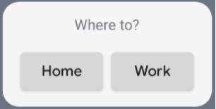
以下代码片段演示了如何创建界面
/* Import Glance Composables In the event there is a name clash with the Compose classes of the same name, you may rename the imports per https://kotlinlang.org/docs/packages.html#imports using the `as` keyword. import androidx.glance.Button import androidx.glance.layout.Column import androidx.glance.layout.Row import androidx.glance.text.Text */ class MyAppWidget : GlanceAppWidget() { override suspend fun provideGlance(context: Context, id: GlanceId) { // Load data needed to render the AppWidget. // Use `withContext` to switch to another thread for long running // operations. provideContent { // create your AppWidget here MyContent() } } @Composable private fun MyContent() { Column( modifier = GlanceModifier.fillMaxSize(), verticalAlignment = Alignment.Top, horizontalAlignment = Alignment.CenterHorizontally ) { Text(text = "Where to?", modifier = GlanceModifier.padding(12.dp)) Row(horizontalAlignment = Alignment.CenterHorizontally) { Button( text = "Home", onClick = actionStartActivity<MyActivity>() ) Button( text = "Work", onClick = actionStartActivity<MyActivity>() ) } } } }
前面的代码示例执行以下操作
- 在顶层
Column中,各项垂直地一个接一个排列。 - 此
Column会展开其大小以匹配可用空间(通过GlanceModifier),并将其内容对齐到顶部(verticalAlignment)并水平居中(horizontalAlignment)。 - 此
Column的内容使用 lambda 定义。顺序很重要。
您可以更改对齐值或应用不同的修饰符值(例如内边距)来更改组件的位置和大小。有关每个类的组件、参数和可用修饰符的完整列表,请参阅参考文档。