Switch 组件允许用户在两种状态之间切换:选中和未选中。在您的应用中,您可以使用开关让用户执行以下操作之一:
- 开启或关闭某项设置。
- 启用或停用某个功能。
- 选择一个选项。
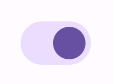
该组件由两部分组成:滑块和轨道。滑块是开关的可拖动部分,轨道是背景。用户可以向左或向右拖动滑块以更改开关的状态。他们也可以轻触开关以选中和清除它。
基本实现
如需完整的 API 定义,请参阅 Switch 参考。以下是一些您可能需要使用的关键参数:
checked:开关的初始状态。onCheckedChange:当开关状态发生变化时调用的回调。enabled:开关是启用还是停用。colors:用于开关的颜色。
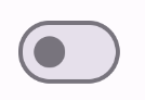
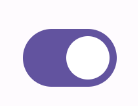
以下示例是 Switch 可组合项的最小实现。
@Composable fun SwitchMinimalExample() { var checked by remember { mutableStateOf(true) } Switch( checked = checked, onCheckedChange = { checked = it } ) }
未选中时,此实现显示如下:
选中时,其显示如下:
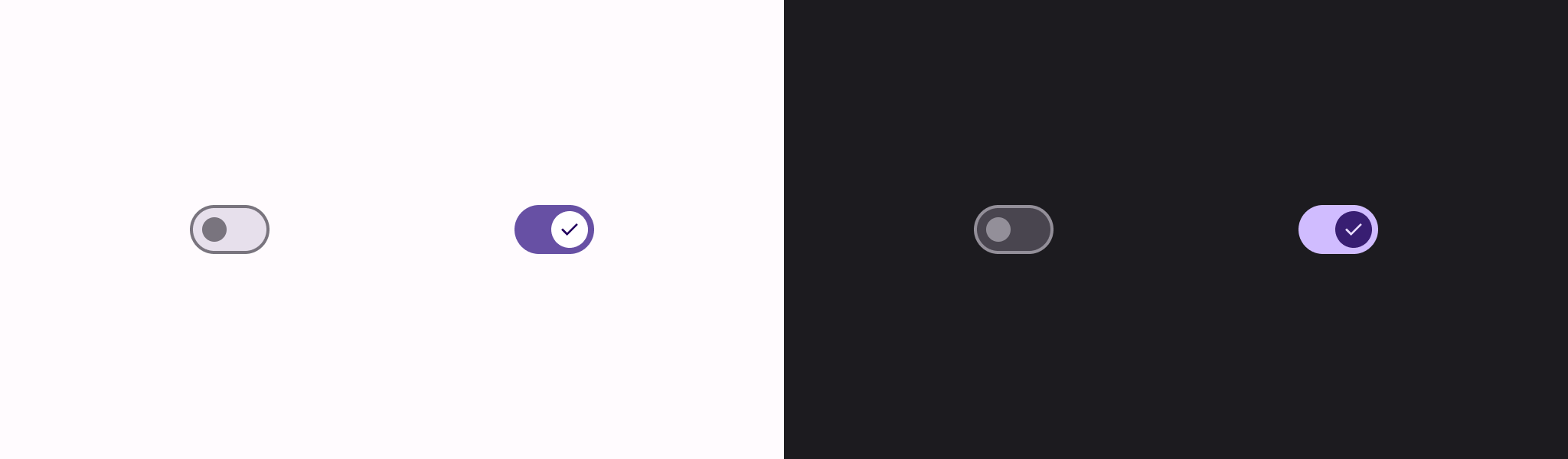
高级实现
在实现更高级的开关时,您可能希望使用的主要参数如下:
thumbContent:使用此参数可自定义滑块选中时的外观。colors:使用此参数可自定义轨道和滑块的颜色。
自定义滑块
您可以为 thumbContent 参数传递任何可组合项来创建自定义滑块。以下是使用自定义图标作为滑块的开关示例:
@Composable fun SwitchWithIconExample() { var checked by remember { mutableStateOf(true) } Switch( checked = checked, onCheckedChange = { checked = it }, thumbContent = if (checked) { { Icon( imageVector = Icons.Filled.Check, contentDescription = null, modifier = Modifier.size(SwitchDefaults.IconSize), ) } } else { null } ) }
在此实现中,未选中时的外观与上一节中的示例相同。但是,选中时,此实现显示如下:
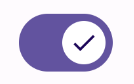
自定义颜色
以下示例演示了如何使用颜色参数更改开关滑块和轨道的颜色,同时考虑开关是否选中。
@Composable fun SwitchWithCustomColors() { var checked by remember { mutableStateOf(true) } Switch( checked = checked, onCheckedChange = { checked = it }, colors = SwitchDefaults.colors( checkedThumbColor = MaterialTheme.colorScheme.primary, checkedTrackColor = MaterialTheme.colorScheme.primaryContainer, uncheckedThumbColor = MaterialTheme.colorScheme.secondary, uncheckedTrackColor = MaterialTheme.colorScheme.secondaryContainer, ) ) }
此实现显示如下: