
在 Compose 中,UI 元素由可组合函数表示,这些函数在调用时会发出一段 UI,然后该 UI 会被添加到 UI 树中并在屏幕上渲染。每个 UI 元素都有一个父级和可能多个子级。每个元素也位于其父级内,指定为 (x, y) 位置,以及一个大小,指定为 width 和 height。
父级定义其子元素的约束。元素被要求在这些约束内定义其大小。约束限制了元素的最小和最大 width 和 height。如果元素有子元素,它可能会测量每个子元素以帮助确定其大小。一旦元素确定并报告了自己的大小,它就有机会定义如何相对于自身放置其子元素,如创建自定义布局中详细描述的那样。
在 UI 树中布局每个节点是一个三步过程。每个节点必须
- 测量所有子项
- 确定自身大小
- 放置其子项

作用域的使用定义了您何时可以测量和放置您的子项。布局的测量只能在测量和布局阶段进行,而子项只能在布局阶段放置(并且只能在测量之后)。由于 Compose 作用域(例如 MeasureScope 和 PlacementScope),这在编译时强制执行。
使用布局修饰符
您可以使用 layout 修饰符修改元素的测量和布局方式。Layout 是一个 lambda;其参数包括您可以测量的元素(作为 measurable 传入)和该可组合项的传入约束(作为 constraints 传入)。自定义布局修饰符可能如下所示
fun Modifier.customLayoutModifier() = layout { measurable, constraints -> // ... }
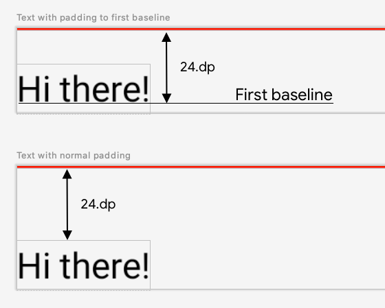
我们来在屏幕上显示一个 Text 并控制从顶部到第一行文本基线的距离。这正是 paddingFromBaseline 修饰符所做的工作,我们在此将其作为示例实现。为此,请使用 layout 修饰符手动将可组合项放置在屏幕上。以下是所需行为,其中 Text 的顶部内边距设置为 24.dp
以下是生成该间距的代码
fun Modifier.firstBaselineToTop( firstBaselineToTop: Dp ) = layout { measurable, constraints -> // Measure the composable val placeable = measurable.measure(constraints) // Check the composable has a first baseline check(placeable[FirstBaseline] != AlignmentLine.Unspecified) val firstBaseline = placeable[FirstBaseline] // Height of the composable with padding - first baseline val placeableY = firstBaselineToTop.roundToPx() - firstBaseline val height = placeable.height + placeableY layout(placeable.width, height) { // Where the composable gets placed placeable.placeRelative(0, placeableY) } }
以下是该代码中发生的情况
- 在
measurablelambda 参数中,您通过调用measurable.measure(constraints)来测量由 measurable 参数表示的Text。 - 您通过调用
layout(width, height)方法指定可组合项的大小,该方法还提供一个用于放置包装元素的 lambda。在这种情况下,它是最后一个基线和添加的顶部内边距之间的高度。 - 您通过调用
placeable.place(x, y)将包装元素放置在屏幕上。如果未放置包装元素,它们将不可见。y位置对应于顶部内边距 - 文本第一个基线的位置。
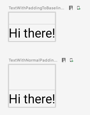
要验证这是否按预期工作,请在 Text 上使用此修饰符
@Preview @Composable fun TextWithPaddingToBaselinePreview() { MyApplicationTheme { Text("Hi there!", Modifier.firstBaselineToTop(32.dp)) } } @Preview @Composable fun TextWithNormalPaddingPreview() { MyApplicationTheme { Text("Hi there!", Modifier.padding(top = 32.dp)) } }
创建自定义布局
layout 修饰符只更改调用可组合项。要测量和布局多个可组合项,请改用 Layout 可组合项。此可组合项允许您手动测量和布局子项。Column 和 Row 等所有高级布局都是使用 Layout 可组合项构建的。
我们来构建一个非常基本的 Column 版本。大多数自定义布局都遵循此模式
@Composable fun MyBasicColumn( modifier: Modifier = Modifier, content: @Composable () -> Unit ) { Layout( modifier = modifier, content = content ) { measurables, constraints -> // measure and position children given constraints logic here // ... } }
与 layout 修饰符类似,measurables 是需要测量的子项列表,constraints 是来自父级的约束。遵循与之前相同的逻辑,MyBasicColumn 可以这样实现
@Composable fun MyBasicColumn( modifier: Modifier = Modifier, content: @Composable () -> Unit ) { Layout( modifier = modifier, content = content ) { measurables, constraints -> // Don't constrain child views further, measure them with given constraints // List of measured children val placeables = measurables.map { measurable -> // Measure each children measurable.measure(constraints) } // Set the size of the layout as big as it can layout(constraints.maxWidth, constraints.maxHeight) { // Track the y co-ord we have placed children up to var yPosition = 0 // Place children in the parent layout placeables.forEach { placeable -> // Position item on the screen placeable.placeRelative(x = 0, y = yPosition) // Record the y co-ord placed up to yPosition += placeable.height } } } }
子可组合项受 Layout 约束(不包括 minHeight 约束)的约束,并且它们根据前一个可组合项的 yPosition 进行放置。
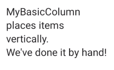
以下是此自定义可组合项的使用方式
@Composable fun CallingComposable(modifier: Modifier = Modifier) { MyBasicColumn(modifier.padding(8.dp)) { Text("MyBasicColumn") Text("places items") Text("vertically.") Text("We've done it by hand!") } }
布局方向
通过更改 LocalLayoutDirection 组合本地化来更改可组合项的布局方向。
如果您手动在屏幕上放置可组合项,LayoutDirection 是 layout 修饰符或 Layout 可组合项的 LayoutScope 的一部分。
使用 layoutDirection 时,使用 place 放置可组合项。与 placeRelative 方法不同,place 不会根据布局方向(从左到右或从右到左)而改变。
自定义布局实战
在Compose 中的基本布局中了解有关布局和修饰符的更多信息,并在创建自定义布局的 Compose 示例中查看自定义布局实战。
了解详情
要了解 Compose 中的自定义布局,请查阅以下其他资源。
视频
为您推荐
- 注意:如果 JavaScript 关闭,将显示链接文本
- Compose 布局中的固有测量
- Compose 中的图形
- Compose 修饰符