
Wear OS 上的应用使用与其他 Android 设备相同的布局技术,但需要针对手表特有的限制进行设计。
注意:不要将移动应用的精确功能和 UI 直接移植到 Wear OS 上,并期望获得良好的用户体验。
如果您为矩形手持设备设计应用,则屏幕角落附近的内容可能会在圆形手表上被裁剪。如果使用的是可滚动的垂直列表,则问题较小,因为用户可以滚动以使内容居中。但是,对于单个屏幕,这可能会提供糟糕的用户体验。
如果您使用以下设置进行布局,文本会在圆形屏幕的设备上显示不正确
<androidx.constraintlayout.widget.ConstraintLayout
    xmlns:android="http://schemas.android.com/apk/res/android"
    xmlns:app="http://schemas.android.com/apk/res-auto"
    xmlns:tools="http://schemas.android.com/tools"
    android:layout_width="match_parent"
    android:layout_height="match_parent">

    <TextView
        android:id="@+id/text"
        android:layout_width="0dp"
        android:layout_height="0dp"
        android:text="@string/very_long_hello_world"
        app:layout_constraintBottom_toBottomOf="parent"
        app:layout_constraintEnd_toEndOf="parent"
        app:layout_constraintStart_toStartOf="parent"
        app:layout_constraintTop_toTopOf="parent" />

</androidx.constraintlayout.widget.ConstraintLayout>
为了解决此问题,请使用 Wear OS UI 库中支持圆形设备的布局。
- 您可以使用
BoxInsetLayout来防止视图在圆形屏幕边缘附近被裁剪。 - 当您想要显示和操作针对圆形屏幕优化的垂直项目列表时,可以使用
WearableRecyclerView来创建弧形布局。
有关应用设计的更多信息,请阅读Wear OS 设计指南。
使用 BoxInsetLayout
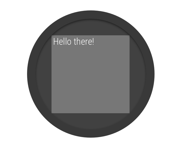
图 2. 圆形屏幕上的窗口插入边距。
Wear OS UI 库中的 BoxInsetLayout 类允许您定义适用于圆形屏幕的布局。此类可让您轻松地将视图对齐到屏幕中央或靠近边缘。
图 2 中的灰色方块显示了 BoxInsetLayout 在应用所需的窗口插入边距后可以在圆形屏幕上自动放置其子视图的区域。要在该区域内显示,子视图需指定 layout_boxedEdges 属性,其值为:
top、bottom、left和right的组合。例如,"left|top"值会将子项的左边缘和上边缘定位到图 2 中的灰色方块内。"all"值会将所有子项的内容定位到图 2 中的灰色方块内。这是与内部ConstraintLayout配合使用时最常见的方法。
图 2 中所示的布局使用 <BoxInsetLayout> 元素,并且适用于圆形屏幕
<androidx.wear.widget.BoxInsetLayout
    xmlns:android="http://schemas.android.com/apk/res/android"
    xmlns:app="http://schemas.android.com/apk/res-auto"
    android:layout_height="match_parent"
    android:layout_width="match_parent"
    android:padding="15dp">

    <androidx.constraintlayout.widget.ConstraintLayout
        android:layout_width="match_parent"
        android:layout_height="match_parent"
        android:padding="5dp"
        app:layout_boxedEdges="all">

        <TextView
            android:layout_height="wrap_content"
            android:layout_width="match_parent"
            android:text="@string/sometext"
            android:textAlignment="center"
            app:layout_constraintEnd_toEndOf="parent"
            app:layout_constraintStart_toStartOf="parent"
            app:layout_constraintTop_toTopOf="parent" />

        <ImageButton
            android:background="@android:color/transparent"
            android:layout_height="50dp"
            android:layout_width="50dp"
            app:layout_constraintBottom_toBottomOf="parent"
            app:layout_constraintStart_toStartOf="parent"
            android:src="@drawable/cancel" />

        <ImageButton
            android:background="@android:color/transparent"
            android:layout_height="50dp"
            android:layout_width="50dp"
            app:layout_constraintBottom_toBottomOf="parent"
            app:layout_constraintEnd_toEndOf="parent"
            android:src="@drawable/ok" />

    </androidx.constraintlayout.widget.ConstraintLayout>

</androidx.wear.widget.BoxInsetLayout>
请注意布局中加粗的部分
-
android:padding="15dp"此行将内边距分配给
<BoxInsetLayout>元素。 -
android:padding="5dp"此行将内边距分配给内部
ConstraintLayout元素。 -
app:layout_boxedEdges="all"此行可确保
ConstraintLayout元素及其子元素在圆形屏幕上被限制在由窗口插入边距定义的区域内。
使用弧形布局
Wear OS UI 库中的 WearableRecyclerView 类允许您选择针对圆形屏幕优化的弧形布局。要在应用中为可滚动列表启用弧形布局,请参阅在 Wear OS 上创建列表。