
1. 简介
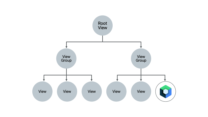
Compose 和 View 系统可以并行工作。
在本 Codelab 中,你将把 Sunflower 应用的植物详情屏幕部分迁移到 Compose。我们创建了一个项目副本,供你尝试将一个真实的应用程序迁移到 Compose。
在本 Codelab 结束时,如果你愿意,你可以继续迁移并转换 Sunflower 的其余屏幕。
在学习本 Codelab 的过程中,如需更多支持,请参阅以下代码演练
你将学习的内容
在本 Codelab 中,你将学习
- 你可以遵循的不同迁移路径
- 如何将应用逐步迁移到 Compose
- 如何将 Compose 添加到使用 Views 构建的现有屏幕
- 如何在 Compose 中使用 View
- 如何在 Compose 中创建主题
- 如何测试使用 Views 和 Compose 混合编写的屏幕
前提条件
- 熟悉 Kotlin 语法,包括 lambda 表达式
- 了解 Compose 的基础知识
你需要的物品
2. 迁移策略
Jetpack Compose 从一开始就设计了 View 互操作性。为了迁移到 Compose,我们推荐一种增量迁移方法,其中 Compose 和 View 在你的代码库中共存,直到你的应用完全使用 Compose 构建。
推荐的迁移策略如下
- 使用 Compose 构建新屏幕
- 在构建功能时,识别可复用元素并开始创建通用 UI 组件库
- 一次一个屏幕地替换现有功能
使用 Compose 构建新屏幕
使用 Compose 构建包含整个屏幕的新功能是推动你采用 Compose 的最佳方式。通过这种策略,你可以在满足公司业务需求的同时,添加功能并利用 Compose 的优势
新功能可能包含整个屏幕,在这种情况下,整个屏幕将使用 Compose。如果你使用基于 Fragment 的导航,这意味着你将创建一个新的 Fragment,并将其内容放在 Compose 中。
你还可以在现有屏幕中引入新功能。在这种情况下,Views 和 Compose 将在同一屏幕上共存。例如,假设你添加的功能是 RecyclerView 中的一种新的 View 类型。在这种情况下,新的 View 类型将使用 Compose,同时保持其他项不变。
构建通用 UI 组件库
在使用 Compose 构建功能时,你会很快意识到最终会构建一个组件库。你将需要识别可复用组件,以促进在整个应用中的复用,从而使共享组件具有单一事实来源。然后,你构建的新功能可以依赖于此库。
使用 Compose 替换现有功能
除了构建新功能外,你还需要逐步将应用中的现有功能迁移到 Compose。如何着手取决于你,但这里有一些不错的候选者
- 简单屏幕 - 应用中具有少量 UI 元素和动态性的简单屏幕,例如欢迎屏幕、确认屏幕或设置屏幕。这些是迁移到 Compose 的理想候选者,因为只需几行代码即可完成。
- 混合 View 和 Compose 屏幕 - 已经包含少量 Compose 代码的屏幕是另一个不错的候选者,因为你可以逐步迁移该屏幕中的元素。如果你的屏幕中只有一部分子树使用 Compose,你可以继续迁移树的其他部分,直到整个 UI 都使用 Compose。这被称为迁移的自下而上方法。
本 Codelab 中的方法
在本 Codelab 中,你将对 Sunflower 的植物详情屏幕进行增量迁移到 Compose,使 Compose 和 Views 协同工作。之后,如果你愿意,你将掌握足够的知识来继续迁移。
3. 设置
获取代码
从 GitHub 获取 codelab 代码
$ git clone https://github.com/android/codelab-android-compose
或者,你可以将仓库下载为 Zip 文件
运行示例应用
你刚刚下载的代码包含所有可用的 Compose Codelab 的代码。要完成本 Codelab,请在 Android Studio 中打开 MigrationCodelab 项目。
在本 Codelab 中,你将把 Sunflower 应用的植物详情屏幕迁移到 Compose。你可以通过点击植物列表屏幕中可用的植物之一来打开植物详情屏幕。
项目设置
项目构建在多个 git 分支中
main分支是 Codelab 的起点。end分支包含本 Codelab 的解决方案。
我们建议你从 main 分支的代码开始,并按照自己的节奏逐步学习 Codelab。
在 Codelab 期间,你将看到需要添加到项目中的代码片段。在某些地方,你还需要移除代码片段注释中明确提到的代码。
要使用 git 获取 end 分支,请 cd 进入 MigrationCodelab 项目目录,然后使用命令
$ git checkout end
或从这里下载解决方案代码
常见问题解答
4. Sunflower 中的 Compose
你从 main 分支下载的代码中已经添加了 Compose。但是,让我们看看它需要什么才能工作。
如果你打开应用级别的 build.gradle 文件,你会看到它如何导入 Compose 依赖项并通过使用 buildFeatures { compose true } 标志启用 Android Studio 与 Compose 一起工作。
app/build.gradle
android {
    //...
    kotlinOptions {
        jvmTarget = '1.8'
    }
    buildFeatures {
        //...
        compose true
    }
    composeOptions {
        kotlinCompilerExtensionVersion '1.3.2'
    }
}

dependencies {
    //...
    // Compose
    def composeBom = platform('androidx.compose:compose-bom:2024.09.02')
    implementation(composeBom)
    androidTestImplementation(composeBom)

    implementation "androidx.compose.runtime:runtime"
    implementation "androidx.compose.ui:ui"
    implementation "androidx.compose.foundation:foundation"
    implementation "androidx.compose.foundation:foundation-layout"
    implementation "androidx.compose.material3:material3"
    implementation "androidx.compose.runtime:runtime-livedata"
    implementation "androidx.compose.ui:ui-tooling"
    //...
}
这些依赖项的版本在项目级别的 build.gradle 文件中定义。
5. Hello Compose!
在植物详情屏幕中,我们将把植物的描述迁移到 Compose,同时保持屏幕的整体结构不变。
Compose 需要一个宿主 Activity 或 Fragment 才能渲染 UI。在 Sunflower 中,由于所有屏幕都使用 Fragment,你将使用 ComposeView:一个 Android View,可以使用其 setContent 方法托管 Compose UI 内容。
移除 XML 代码
让我们开始迁移!打开 fragment_plant_detail.xml 并执行以下操作
- 切换到代码视图
- 移除
NestedScrollView中的ConstraintLayout代码和 4 个嵌套的TextView(Codelab 在迁移单个项时会比较和引用 XML 代码,注释掉代码会很有用) - 添加一个将托管 Compose 代码的
ComposeView,其视图 ID 为compose_view
fragment_plant_detail.xml
<androidx.core.widget.NestedScrollView
    android:id="@+id/plant_detail_scrollview"
    android:layout_width="match_parent"
    android:layout_height="match_parent"
    android:clipToPadding="false"
    android:paddingBottom="@dimen/fab_bottom_padding"
    app:layout_behavior="@string/appbar_scrolling_view_behavior">

    <!-- Step 2) Comment out ConstraintLayout and its children –->
    <androidx.constraintlayout.widget.ConstraintLayout
        android:layout_width="match_parent"
        android:layout_height="match_parent"
        android:layout_margin="@dimen/margin_normal">

        <TextView
            android:id="@+id/plant_detail_name"
        ...

    </androidx.constraintlayout.widget.ConstraintLayout>
    <!-- End Step 2) Comment out until here –->

    <!-- Step 3) Add a ComposeView to host Compose code –->
    <androidx.compose.ui.platform.ComposeView
        android:id="@+id/compose_view"
        android:layout_width="match_parent"
        android:layout_height="match_parent"/>

</androidx.core.widget.NestedScrollView>
添加 Compose 代码
至此,你已准备好开始将植物详情屏幕迁移到 Compose!
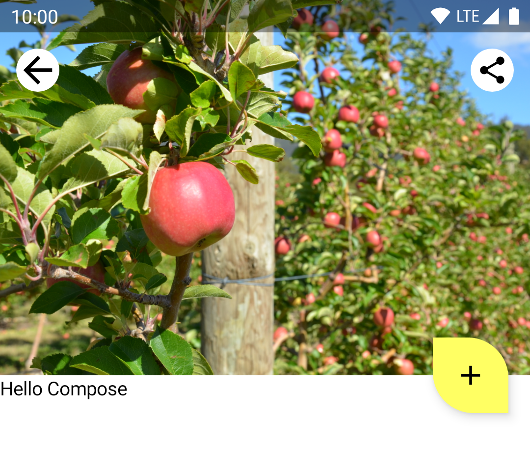
在整个 Codelab 中,你将向 plantdetail 文件夹下的 PlantDetailDescription.kt 文件添加 Compose 代码。打开它,看看项目中已经有一个占位符文本 "Hello Compose"。
PlantDetailDescription.kt
@Composable
fun PlantDetailDescription() {
    Surface {
        Text("Hello Compose")
    }
}
让我们通过在上一步中添加的 ComposeView 调用此可组合项来将其显示在屏幕上。打开 PlantDetailFragment.kt。
由于屏幕使用数据绑定,你可以直接访问 composeView 并调用 setContent 在屏幕上显示 Compose 代码。由于 Sunflower 使用 Material Design,请在 MaterialTheme 中调用 PlantDetailDescription 可组合项。
PlantDetailFragment.kt
class PlantDetailFragment : Fragment() {
    // ...
    override fun onCreateView(...): View? {
        val binding = DataBindingUtil.inflate<FragmentPlantDetailBinding>(
            inflater, R.layout.fragment_plant_detail, container, false
        ).apply {
            // ...
            composeView.setContent {
                // You're in Compose world!
                MaterialTheme {
                    PlantDetailDescription()
                }
            }
        }
        // ...
    }
}
如果你运行应用,你可以在屏幕上看到 "Hello Compose"。
6. 从 XML 创建可组合项
让我们从迁移植物名称开始。更准确地说,是你在 fragment_plant_detail.xml 中移除的 ID 为 @+id/plant_detail_name 的 TextView。以下是 XML 代码
<TextView
    android:id="@+id/plant_detail_name"
    ...
    android:layout_marginStart="@dimen/margin_small"
    android:layout_marginEnd="@dimen/margin_small"
    android:gravity="center_horizontal"
    android:text="@{viewModel.plant.name}"
    android:textAppearance="?attr/textAppearanceHeadline5"
    ... />
看看它有一个 textAppearanceHeadline5 样式,水平外边距为 8.dp,并且在屏幕上水平居中。但是,要显示的标题是从 PlantDetailViewModel 暴露的 LiveData 中观察到的,该 LiveData 来自仓库层。
由于观察 LiveData 将在后面介绍,我们先假设我们已经有了名称,并将其作为参数传递给我们将在 PlantDetailDescription.kt 文件中创建的*新的* PlantName 可组合项。此可组合项稍后将从 PlantDetailDescription 可组合项中调用。
PlantDetailDescription.kt
@Composable
private fun PlantName(name: String) {
Text(
text = name,
style = MaterialTheme.typography.headlineSmall,
modifier = Modifier
.fillMaxWidth()
.padding(horizontal = dimensionResource(R.dimen.margin_small))
.wrapContentWidth(Alignment.CenterHorizontally)
)
}
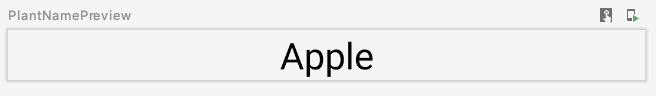
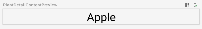
@Preview
@Composable
private fun PlantNamePreview() {
MaterialTheme {
PlantName("Apple")
}
}
使用预览
其中
Text的样式是MaterialTheme.typography.headlineSmall,这与 XML 代码中的textAppearanceHeadline5类似。- 修饰符装饰 Text,使其看起来像 XML 版本
- 使用
fillMaxWidth修饰符,使其占据可用的最大宽度。此修饰符对应于 XML 代码中layout_width属性的match_parent值。 - 使用
padding修饰符,以便应用水平填充值margin_small。这对应于 XML 中的marginStart和marginEnd声明。margin_small值也是现有维度资源,使用dimensionResource帮助函数获取。 - 使用
wrapContentWidth修饰符来对齐文本,使其水平居中。这类似于 XML 中gravity的center_horizontal。
7. ViewModels 和 LiveData
现在,让我们将标题连接到屏幕。为此,你需要使用 PlantDetailViewModel 加载数据。为此,Compose 集成了 ViewModel 和 LiveData。
ViewModels
由于在 Fragment 中使用了 PlantDetailViewModel 的实例,我们可以将其作为参数传递给 PlantDetailDescription,这样就可以了。
打开 PlantDetailDescription.kt 文件,并向 PlantDetailDescription 添加 PlantDetailViewModel 参数
PlantDetailDescription.kt
@Composable
fun PlantDetailDescription(plantDetailViewModel: PlantDetailViewModel) {
    //...
}
现在,从 fragment 调用此可组合项时传递 ViewModel 的实例
PlantDetailFragment.kt
class PlantDetailFragment : Fragment() {
    ...
    override fun onCreateView(...): View? {
        ...
        composeView.setContent {
            MaterialTheme {
                PlantDetailDescription(plantDetailViewModel)
            }
        }
    }
}
LiveData
有了这些,你就可以访问 PlantDetailViewModel 的 LiveData<Plant> 字段来获取植物的名称了。
要从可组合项中观察 LiveData,请使用 LiveData.observeAsState() 函数。
由于 LiveData 发出的值可能为 null,你需要将它的使用包裹在 null 检查中。因此,为了可重用性,最好在不同的可组合项中分割 LiveData 的使用和监听。所以,让我们创建一个新的可组合项,称为 PlantDetailContent,它将显示 Plant 信息。
通过这些更新,PlantDetailDescription.kt 文件现在应该如下所示
PlantDetailDescription.kt
@Composable
fun PlantDetailDescription(plantDetailViewModel: PlantDetailViewModel) {
// Observes values coming from the VM's LiveData<Plant> field
val plant by plantDetailViewModel.plant.observeAsState()
// If plant is not null, display the content
plant?.let {
PlantDetailContent(it)
}
}
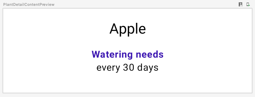
@Composable
fun PlantDetailContent(plant: Plant) {
PlantName(plant.name)
}
@Preview
@Composable
private fun PlantDetailContentPreview() {
val plant = Plant("id", "Apple", "description", 3, 30, "")
MaterialTheme {
PlantDetailContent(plant)
}
}
PlantNamePreview 应该反映我们的更改,而无需直接更新它,因为 PlantDetailContent 只调用了 PlantName
现在,你已经连接了 ViewModel,以便在 Compose 中显示植物名称。在接下来的几节中,你将构建其余的可组合项,并以类似的方式将它们连接到 ViewModel。
8. 更多 XML 代码迁移
现在,完成我们 UI 中缺失的部分(浇水信息和植物描述)变得更容易了。遵循与之前类似的方法,你已经可以迁移屏幕的其余部分。
你之前从 fragment_plant_detail.xml 中移除的浇水信息 XML 代码由两个 TextView 组成,它们的 ID 分别是 plant_watering_header 和 plant_watering。
<TextView
    android:id="@+id/plant_watering_header"
    ...
    android:layout_marginStart="@dimen/margin_small"
    android:layout_marginTop="@dimen/margin_normal"
    android:layout_marginEnd="@dimen/margin_small"
    android:gravity="center_horizontal"
    android:text="@string/watering_needs_prefix"
    android:textColor="?attr/colorAccent"
    android:textStyle="bold"
    ... />

<TextView
    android:id="@+id/plant_watering"
    ...
    android:layout_marginStart="@dimen/margin_small"
    android:layout_marginEnd="@dimen/margin_small"
    android:gravity="center_horizontal"
    app:wateringText="@{viewModel.plant.wateringInterval}"
    .../>
与你之前所做的类似,创建一个新的可组合项,称为 PlantWatering,并添加 Text 可组合项以在屏幕上显示浇水信息
PlantDetailDescription.kt
@OptIn(ExperimentalComposeUiApi::class)
@Composable
private fun PlantWatering(wateringInterval: Int) {
Column(Modifier.fillMaxWidth()) {
// Same modifier used by both Texts
val centerWithPaddingModifier = Modifier
.padding(horizontal = dimensionResource(R.dimen.margin_small))
.align(Alignment.CenterHorizontally)
val normalPadding = dimensionResource(R.dimen.margin_normal)
Text(
text = stringResource(R.string.watering_needs_prefix),
color = MaterialTheme.colorScheme.primaryContainer,
fontWeight = FontWeight.Bold,
modifier = centerWithPaddingModifier.padding(top = normalPadding)
)
val wateringIntervalText = pluralStringResource(
R.plurals.watering_needs_suffix, wateringInterval, wateringInterval
)
Text(
text = wateringIntervalText,
modifier = centerWithPaddingModifier.padding(bottom = normalPadding)
)
}
}
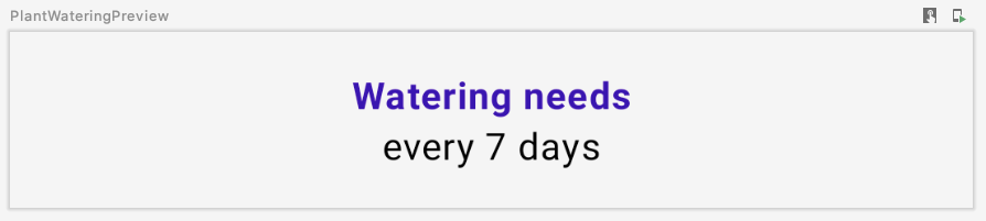
@Preview
@Composable
private fun PlantWateringPreview() {
MaterialTheme {
PlantWatering(7)
}
}
使用预览
需要注意的一些事项
- 由于水平填充和对齐装饰由
Text可组合项共享,你可以通过将其分配给局部变量(即centerWithPaddingModifier)来重用 Modifier。由于修饰符是常规的 Kotlin 对象,你可以这样做。 - Compose 的
MaterialTheme没有与plant_watering_header中使用的colorAccent完全匹配的颜色。目前,我们先使用MaterialTheme.colorScheme.primaryContainer,你将在互操作主题部分对其进行改进。 - 在 Compose 1.2.1 中,使用
pluralStringResource需要选择加入ExperimentalComposeUiApi。在 Compose 的未来版本中,这可能不再需要。
让我们将所有部分连接起来,并在 PlantDetailContent 中调用 PlantWatering。我们在开始时移除的 ConstraintLayout XML 代码有一个 16.dp 的外边距,我们需要将其包含在我们的 Compose 代码中。
<androidx.constraintlayout.widget.ConstraintLayout
    android:layout_width="match_parent"
    android:layout_height="match_parent"
    android:layout_margin="@dimen/margin_normal">
在 PlantDetailContent 中,创建一个 Column 以同时显示名称和浇水信息,并将其作为填充。此外,为了使背景颜色和文本颜色合适,添加一个 Surface 来处理。
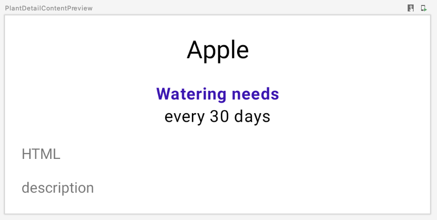
PlantDetailDescription.kt
@Composable
fun PlantDetailContent(plant: Plant) {
    Surface {
        Column(Modifier.padding(dimensionResource(R.dimen.margin_normal))) {
            PlantName(plant.name)
            PlantWatering(plant.wateringInterval)
        }
    }
}
如果你刷新预览,你会看到这个
9. Compose 代码中的 Views
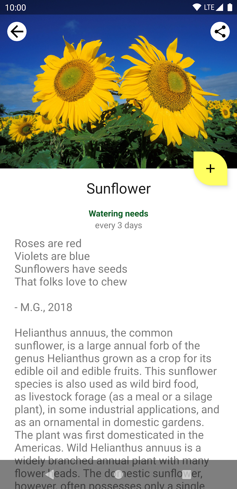
现在,让我们迁移植物描述。 fragment_plant_detail.xml 中的代码有一个 TextView,其中包含 app:renderHtml="@{viewModel.plant.description}",用于告诉 XML 在屏幕上显示什么文本。renderHtml 是一个绑定适配器,你可以在 PlantDetailBindingAdapters.kt 文件中找到它。其实现使用 HtmlCompat.fromHtml 来设置 TextView 上的文本!
然而,Compose 目前不支持 Spanned 类,也不支持显示 HTML 格式的文本。因此,我们需要在 Compose 代码中使用 View 系统中的 TextView 来绕过此限制。
由于 Compose 尚不能渲染 HTML 代码,你将使用 AndroidView API 以编程方式创建一个 TextView 来完成这项工作。
AndroidView 允许你在其 factory lambda 中构造一个 View。它还提供一个 update lambda,当 View 被膨胀以及后续重新组合时会调用它。
让我们通过创建一个新的 PlantDescription 可组合项来实现这一点。此可组合项调用 AndroidView,后者在其 factory lambda 中构造一个 TextView。在 factory lambda 中,初始化一个显示 HTML 格式文本的 TextView,然后将其 movementMethod 设置为 LinkMovementMethod 的实例。最后,在 update lambda 中将 TextView 的文本设置为 htmlDescription。
PlantDetailDescription.kt
@Composable
private fun PlantDescription(description: String) {
// Remembers the HTML formatted description. Re-executes on a new description
val htmlDescription = remember(description) {
HtmlCompat.fromHtml(description, HtmlCompat.FROM_HTML_MODE_COMPACT)
}
// Displays the TextView on the screen and updates with the HTML description when inflated
// Updates to htmlDescription will make AndroidView recompose and update the text
AndroidView(
factory = { context ->
TextView(context).apply {
movementMethod = LinkMovementMethod.getInstance()
}
},
update = {
it.text = htmlDescription
}
)
}
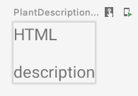
@Preview
@Composable
private fun PlantDescriptionPreview() {
MaterialTheme {
PlantDescription("HTML<br><br>description")
}
}
预览
请注意,htmlDescription 会记住作为参数传递的给定 description 的 HTML 描述。如果 description 参数更改,remember 内部的 htmlDescription 代码将再次执行。
因此,如果 htmlDescription 更改,AndroidView 更新回调将重新组合。在 update lambda 中读取的任何状态都会导致重新组合。
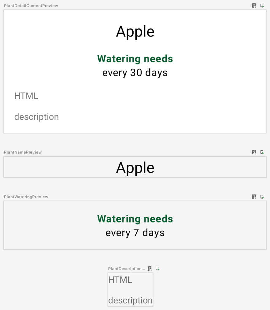
让我们将 PlantDescription 添加到 PlantDetailContent 可组合项,并更改预览代码以也显示 HTML 描述
PlantDetailDescription.kt
@Composable
fun PlantDetailContent(plant: Plant) {
    Surface {
        Column(Modifier.padding(dimensionResource(R.dimen.margin_normal))) {
            PlantName(plant.name)
            PlantWatering(plant.wateringInterval)
            PlantDescription(plant.description)
        }
    }
}

@Preview
@Composable
private fun PlantDetailContentPreview() {
    val plant = Plant("id", "Apple", "HTML<br><br>description", 3, 30, "")
    MaterialTheme {
        PlantDetailContent(plant)
    }
}
使用预览
至此,你已将原始 ConstraintLayout 内的所有内容迁移到 Compose。你可以运行应用以检查其是否按预期工作。
10. ViewCompositionStrategy
每当 ComposeView 与窗口分离时,Compose 就会处理掉组合。这在 Fragment 中使用 ComposeView 时是不希望发生的,原因有二
- Compose UI
View类型必须遵循Fragment 的视图生命周期来保存状态。 - 当发生过渡时,底层的
ComposeView将处于分离状态。然而,Compose UI 元素在这些过渡期间仍然可见。
要修改此行为,请使用适当的 ViewCompositionStrategy 调用 setViewCompositionStrategy,使其遵循 Fragment 的视图生命周期。具体来说,你会想要使用 DisposeOnViewTreeLifecycleDestroyed 策略,以便在 Fragment 的 LifecycleOwner 被销毁时处理掉组合。
由于 PlantDetailFragment 具有进入和退出过渡(查看 nav_garden.xml 获取更多信息),并且我们稍后将在 Compose 中使用 View 类型,我们需要确保 ComposeView 使用 DisposeOnViewTreeLifecycleDestroyed 策略。尽管如此,在 Fragment 中使用 ComposeView 时,始终设置此策略是最佳实践。
PlantDetailFragment.kt
import androidx.compose.ui.platform.ViewCompositionStrategy
...

class PlantDetailFragment : Fragment() {
    ...
    override fun onCreateView(...): View? {
        val binding = DataBindingUtil.inflate<FragmentPlantDetailBinding>(
            inflater, R.layout.fragment_plant_detail, container, false
        ).apply {
            ...
            composeView.apply {
                // Dispose the Composition when the view's LifecycleOwner
                // is destroyed
                setViewCompositionStrategy(
                    ViewCompositionStrategy.DisposeOnViewTreeLifecycleDestroyed
                )
                setContent {
                    MaterialTheme {
                        PlantDetailDescription(plantDetailViewModel)
                    }
                }
            }
        }
        ...
    }
}
11. Material 主题
我们已经将植物详情的文本内容迁移到 Compose。但是,你可能已经注意到 Compose 没有使用正确的主题颜色。它在植物名称中使用了紫色,而应该使用绿色。
要使用正确的主题颜色,你需要通过定义自己的主题并提供主题颜色来定制 MaterialTheme。
定制 MaterialTheme
要创建自己的主题,请打开 theme 包下的 Theme.kt 文件。Theme.kt 定义了一个名为 SunflowerTheme 的可组合项,它接受一个内容 lambda 并将其传递给 MaterialTheme。
它目前还没有做任何有趣的事情——你接下来会定制它。
Theme.kt
import androidx.compose.material3.MaterialTheme
import androidx.compose.runtime.Composable

@Composable
fun SunflowerTheme(
    content: @Composable () -> Unit
) {
    MaterialTheme(content = content)
}
MaterialTheme 允许你定制其颜色、排版和形状。现在,继续通过提供 Sunflower View 主题中的相同颜色来定制颜色。SunflowerTheme 还可以接受一个名为 darkTheme 的布尔参数,如果系统处于深色模式,则默认值为 true,否则为 false。使用此参数,我们可以将正确的颜色值传递给 MaterialTheme 以匹配当前设置的系统主题。
Theme.kt
@Composable
fun SunflowerTheme(
    darkTheme: Boolean = isSystemInDarkTheme(),
    content: @Composable () -> Unit
) {
    val lightColors  = lightColorScheme(
        primary = colorResource(id = R.color.sunflower_green_500),
        primaryContainer = colorResource(id = R.color.sunflower_green_700),
        secondary = colorResource(id = R.color.sunflower_yellow_500),
        background = colorResource(id = R.color.sunflower_green_500),
        onPrimary = colorResource(id = R.color.sunflower_black),
        onSecondary = colorResource(id = R.color.sunflower_black),
    )
    val darkColors  = darkColorScheme(
        primary = colorResource(id = R.color.sunflower_green_100),
        primaryContainer = colorResource(id = R.color.sunflower_green_200),
        secondary = colorResource(id = R.color.sunflower_yellow_300),
        onPrimary = colorResource(id = R.color.sunflower_black),
        onSecondary = colorResource(id = R.color.sunflower_black),
        onBackground = colorResource(id = R.color.sunflower_black),
        surface = colorResource(id = R.color.sunflower_green_100_8pc_over_surface),
        onSurface = colorResource(id = R.color.sunflower_white),
    )
    val colors = if (darkTheme) darkColors else lightColors
    MaterialTheme(
        colorScheme = colors,
        content = content
    )
}
要使用此主题,请将 MaterialTheme 的使用替换为 SunflowerTheme。例如,在 PlantDetailFragment 中
PlantDetailFragment.kt
class PlantDetailFragment : Fragment() {
    ...
    composeView.apply {
        ...
        setContent {
            SunflowerTheme {
                PlantDetailDescription(plantDetailViewModel)
            }
        }
    }
}
以及 PlantDetailDescription.kt 文件中的所有预览可组合项
PlantDetailDescription.kt
@Preview
@Composable
private fun PlantDetailContentPreview() {
    val plant = Plant("id", "Apple", "HTML<br><br>description", 3, 30, "")
    SunflowerTheme {
        PlantDetailContent(plant)
    }
}

@Preview
@Composable
private fun PlantNamePreview() {
    SunflowerTheme {
        PlantName("Apple")
    }
}

@Preview
@Composable
private fun PlantWateringPreview() {
    SunflowerTheme {
        PlantWatering(7)
    }
}

@Preview
@Composable
private fun PlantDescriptionPreview() {
    SunflowerTheme {
        PlantDescription("HTML<br><br>description")
    }
}
正如你在预览中看到的,颜色现在应该匹配 Sunflower 主题的颜色。
你还可以通过创建一个新函数并将 Configuration.UI_MODE_NIGHT_YES 传递给预览的 uiMode 来在深色主题中预览 UI
import android.content.res.Configuration
...

@Preview(uiMode = Configuration.UI_MODE_NIGHT_YES)
@Composable
private fun PlantDetailContentDarkPreview() {
    val plant = Plant("id", "Apple", "HTML<br><br>description", 3, 30, "")
    SunflowerTheme {
        PlantDetailContent(plant)
    }
}
使用预览
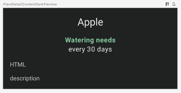
如果你运行应用,它在浅色和深色主题下的行为与迁移之前完全相同
12. 测试
将植物详情屏幕的部分内容迁移到 Compose 后,测试至关重要,以确保你没有破坏任何东西。
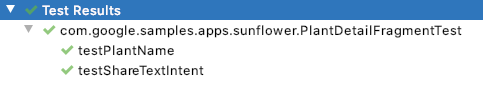
在 Sunflower 中,位于 androidTest 文件夹中的 PlantDetailFragmentTest 测试了应用的一些功能。打开该文件,看看当前的代码
testPlantName检查屏幕上的植物名称testShareTextIntent检查在点击分享按钮后是否触发了正确的 intent
当 Activity 或 Fragment 使用 compose 时,你需要使用 createAndroidComposeRule 来替代 ActivityScenarioRule,它集成了 ActivityScenarioRule 和一个允许你测试 Compose 代码的 ComposeTestRule。
在 PlantDetailFragmentTest 中,将 ActivityScenarioRule 的使用替换为 createAndroidComposeRule。当需要 activity 规则来配置测试时,使用 createAndroidComposeRule 中的 activityRule 属性,如下所示
@RunWith(AndroidJUnit4::class)
class PlantDetailFragmentTest {

    @Rule
    @JvmField
    val composeTestRule = createAndroidComposeRule<GardenActivity>()

    ...

    @Before
    fun jumpToPlantDetailFragment() {
        populateDatabase()

        composeTestRule.activityRule.scenario.onActivity { gardenActivity ->
            activity = gardenActivity

            val bundle = Bundle().apply { putString("plantId", "malus-pumila") }
            findNavController(activity, R.id.nav_host).navigate(R.id.plant_detail_fragment, bundle)
        }
    }

    ...
}
如果你运行测试,testPlantName 将会失败!testPlantName 检查屏幕上是否存在 TextView。但是,你已经将那部分 UI 迁移到了 Compose。因此,你需要使用 Compose 断言来代替
@Test
fun testPlantName() {
    composeTestRule.onNodeWithText("Apple").assertIsDisplayed()
}
如果你运行测试,你会看到所有测试都通过了。
13. 恭喜
恭喜,你已成功完成本 Codelab!
原始 Sunflower github 项目的compose 分支将植物详情屏幕完全迁移到了 Compose。除了你在本 Codelab 中所做的内容,它还模拟了 CollapsingToolbarLayout 的行为。这包括
- 使用 Compose 加载图像
- 动画
- 更好的尺寸处理
- 以及更多!
接下来
查看Compose 学习路径上的其他 Codelab