
1. 简介
上次更新时间 2023-11-21
在本 Codelab 中,您将学习如何使用 Jetpack Compose 中的一些动画 API。
Jetpack Compose 是一种现代 UI 工具包,旨在简化 UI 开发。如果您是 Jetpack Compose 的新手,不妨在尝试本 Codelab 之前先尝试其他一些 Codelab。
您将学到什么
- 如何使用几种基本动画 API
前提条件
- 基本的 Kotlin 知识
- 基本的 Compose 知识,包括
- 简单布局 (Column, Row, Box 等)
- 简单 UI 元素 (Button, Text 等)
- 状态和重组
您需要什么
2. 设置
下载 Codelab 代码。您可以通过以下方式克隆仓库
$ git clone https://github.com/android/codelab-android-compose.git
或者,您可以将仓库下载为 zip 文件
在 Android Studio 中导入 AnimationCodelab 项目。
项目中有多个模块
start是本 Codelab 的起始状态。finished是完成本 Codelab 后应用的最终状态。
确保在运行配置的下拉列表中选择了 start。

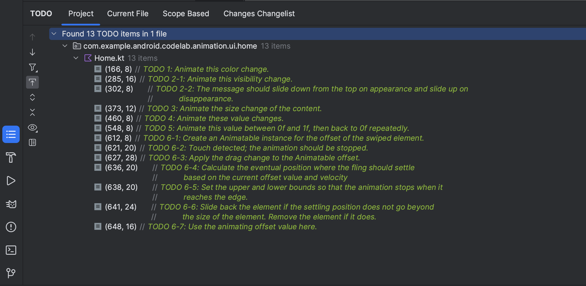
我们将在下一章开始处理几种动画场景。本 Codelab 中处理的每个代码片段都标有 // TODO 注释。一个巧妙的技巧是在 Android Studio 中打开 TODO 工具窗口,然后导航到该章的每个 TODO 注释。
3. 为简单的值更改添加动画
我们从 Compose 中最简单的动画 API 之一开始:animate*AsState API。此 API 应用于为 State 更改添加动画。
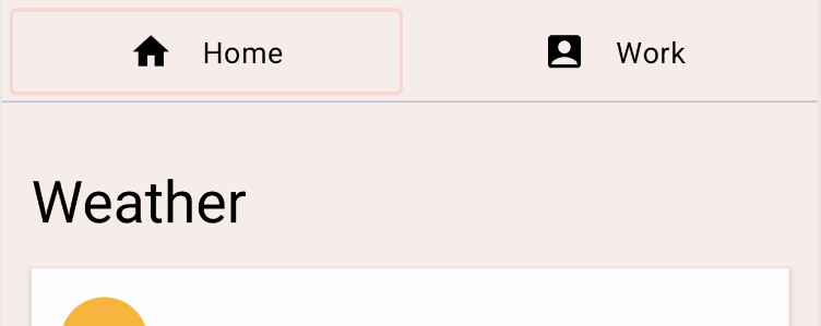
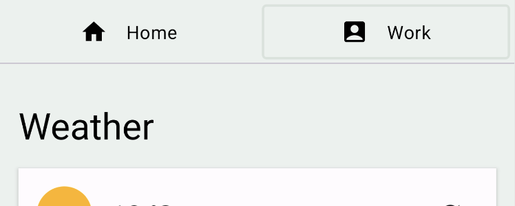
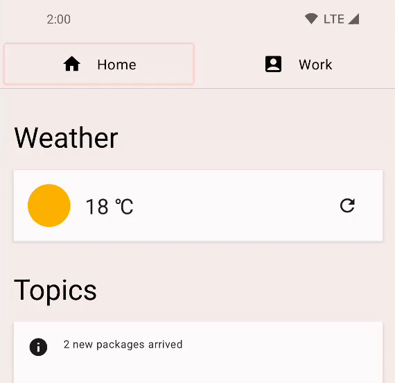
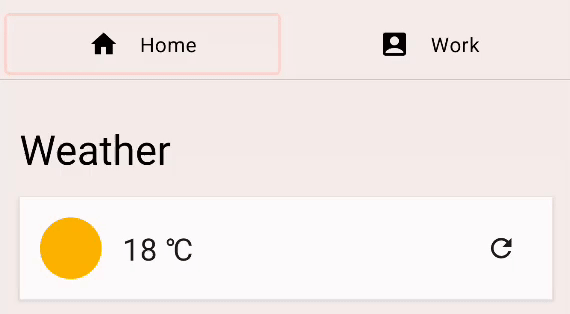
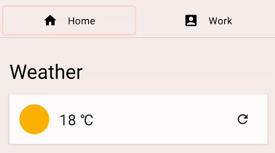
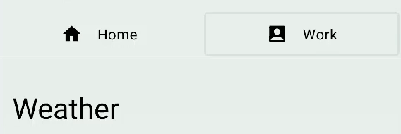
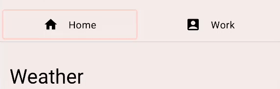
运行 start 配置,然后尝试点击顶部的“Home”和“Work”按钮来切换标签页。它实际上并不会切换标签页内容,但您可以看到内容的背景颜色发生了变化。
|
|
在 TODO 工具窗口中点击 TODO 1,看看它是如何实现的。它位于 Home 可组合项中。
val backgroundColor = if (tabPage == TabPage.Home) Seashell else GreenLight
这里,tabPage 是由 State 对象支持的 TabPage。根据其值,背景颜色在浅粉色和绿色之间切换。我们希望为这个值更改添加动画。
为了为这种简单的值更改添加动画,我们可以使用 animate*AsState API。您可以通过使用相应的 animate*AsState 可组合项变体(在本例中为 animateColorAsState)包装更改的值来创建动画值。返回的值是一个 State<T> 对象,因此我们可以使用带有 by 声明的 局部委托属性,将其视为普通变量。
val backgroundColor by animateColorAsState(
        targetValue = if (tabPage == TabPage.Home) Seashell else GreenLight,
        label = "background color")
重新运行应用并尝试切换标签页。颜色变化现在带有动画效果。
4. 为可见性添加动画
如果您滚动应用内容,您会注意到浮动操作按钮会根据您滚动的方向展开或收缩。
|
|
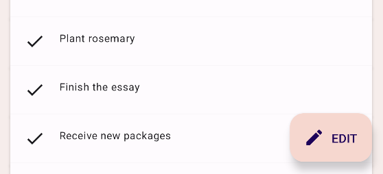
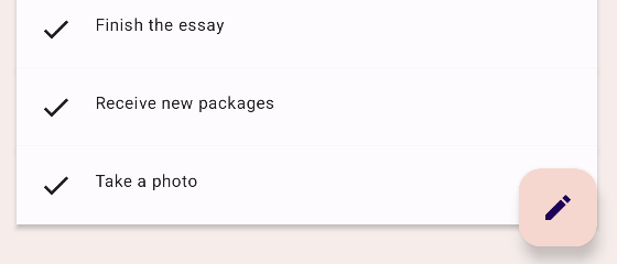
找到 TODO 2-1,查看它是如何工作的。它位于 HomeFloatingActionButton 可组合项中。使用 if 语句来显示或隐藏“EDIT”文本。
if (extended) {
    Text(
        text = stringResource(R.string.edit),
        modifier = Modifier
            .padding(start = 8.dp, top = 3.dp)
    )
}
为这种可见性更改添加动画就像将 if 替换为 AnimatedVisibility 可组合项一样简单。
AnimatedVisibility(extended) {
    Text(
        text = stringResource(R.string.edit),
        modifier = Modifier
            .padding(start = 8.dp, top = 3.dp)
    )
}
运行应用,看看 FAB 现在如何展开和收缩。
AnimatedVisibility 在指定的 Boolean 值每次更改时运行其动画。默认情况下,AnimatedVisibility 通过淡入和展开来显示元素,通过淡出和收缩来隐藏元素。这种行为非常适合 FAB 的示例,但我们也可以自定义行为。
尝试点击 FAB,您应该会看到一条消息:“Edit feature is not supported”。它也使用 AnimatedVisibility 为其出现和消失添加动画。接下来,您将自定义此行为,使消息从顶部滑入,并滑出到顶部。
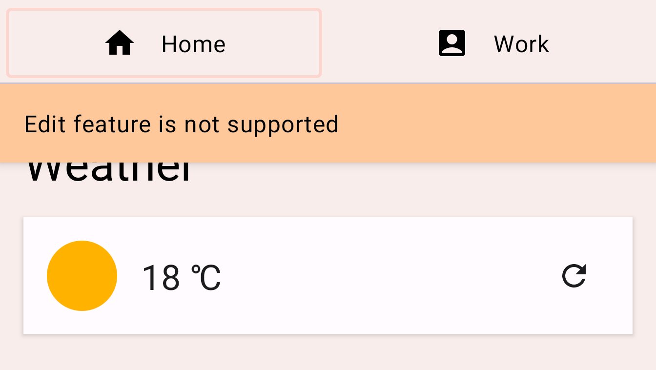
找到 TODO 2-2,查看 EditMessage 可组合项中的代码。
AnimatedVisibility(
    visible = shown
) {
    Surface(
        modifier = Modifier.fillMaxWidth(),
        color = MaterialTheme.colorScheme.secondary,
        elevation = 4.dp
    ) {
        Text(
            text = stringResource(R.string.edit_message),
            modifier = Modifier.padding(16.dp)
        )
    }
}
为了自定义动画,将 enter 和 exit 参数添加到 AnimatedVisibility 可组合项中。
enter 参数应是 EnterTransition 的实例。对于此示例,我们可以使用 slideInVertically 函数创建 EnterTransition,并使用 slideOutVertically 用于退出过渡。按如下方式更改代码
AnimatedVisibility(
    visible = shown,
    enter = slideInVertically(),
    exit = slideOutVertically()
)
再次运行应用,点击编辑按钮,您可能会注意到动画看起来更好,但不完全正确,这是因为 slideInVertically 和 slideOutVertically 的默认行为使用了项目高度的一半。
对于进入过渡:我们可以调整默认行为,使其使用项目的整个高度来正确地为其添加动画,方法是设置 initialOffsetY 参数。initialOffsetY 应该是一个返回初始位置的 lambda。
lambda 接收一个参数,即元素的高度。为了确保项目从屏幕顶部滑入,我们返回其负值,因为屏幕顶部的数值为 0。我们希望动画从 -height 开始到 0(其最终静止位置),以便它从上方开始并动画进入。
使用 slideInVertically 时,滑入后的目标偏移量始终为 0(像素)。initialOffsetY 可以指定为绝对值或元素完整高度的百分比(通过 lambda 函数)。
类似地,slideOutVertically 假定初始偏移量为 0,因此只需指定 targetOffsetY。
AnimatedVisibility(
    visible = shown,
    enter = slideInVertically(
        // Enters by sliding down from offset -fullHeight to 0.
        initialOffsetY = { fullHeight -> -fullHeight }
    ),
    exit = slideOutVertically(
        // Exits by sliding up from offset 0 to -fullHeight.
        targetOffsetY = { fullHeight -> -fullHeight }
    )
) {
    Surface(
        modifier = Modifier.fillMaxWidth(),
        color = MaterialTheme.colorScheme.secondary,
        elevation = 4.dp
    ) {
        Text(
            text = stringResource(R.string.edit_message),
            modifier = Modifier.padding(16.dp)
        )
    }
}
再次运行应用,我们可以看到动画更符合我们的预期
我们可以使用 animationSpec 参数进一步自定义动画。animationSpec 是许多动画 API 的常见参数,包括 EnterTransition 和 ExitTransition。我们可以传入各种 AnimationSpec 类型之一,以指定动画值随时间如何变化。在本示例中,我们使用基于持续时间的简单 AnimationSpec。它可以通过 tween 函数创建。持续时间为 150 毫秒,缓动为 LinearOutSlowInEasing。对于退出动画,我们为 animationSpec 参数使用相同的 tween 函数,但持续时间为 250 毫秒,缓动为 FastOutLinearInEasing。
结果代码应如下所示
AnimatedVisibility(
    visible = shown,
    enter = slideInVertically(
        // Enters by sliding down from offset -fullHeight to 0.
        initialOffsetY = { fullHeight -> -fullHeight },
        animationSpec = tween(durationMillis = 150, easing = LinearOutSlowInEasing)
    ),
    exit = slideOutVertically(
        // Exits by sliding up from offset 0 to -fullHeight.
        targetOffsetY = { fullHeight -> -fullHeight },
        animationSpec = tween(durationMillis = 250, easing = FastOutLinearInEasing)
    )
) {
    Surface(
        modifier = Modifier.fillMaxWidth(),
        color = MaterialTheme.colorScheme.secondary,
        elevation = 4.dp
    ) {
        Text(
            text = stringResource(R.string.edit_message),
            modifier = Modifier.padding(16.dp)
        )
    }
}
运行应用并再次点击 FAB。您现在可以看到消息从顶部滑入和滑出,使用不同的缓动函数和持续时间

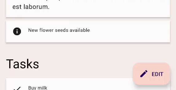
5. 为内容尺寸更改添加动画
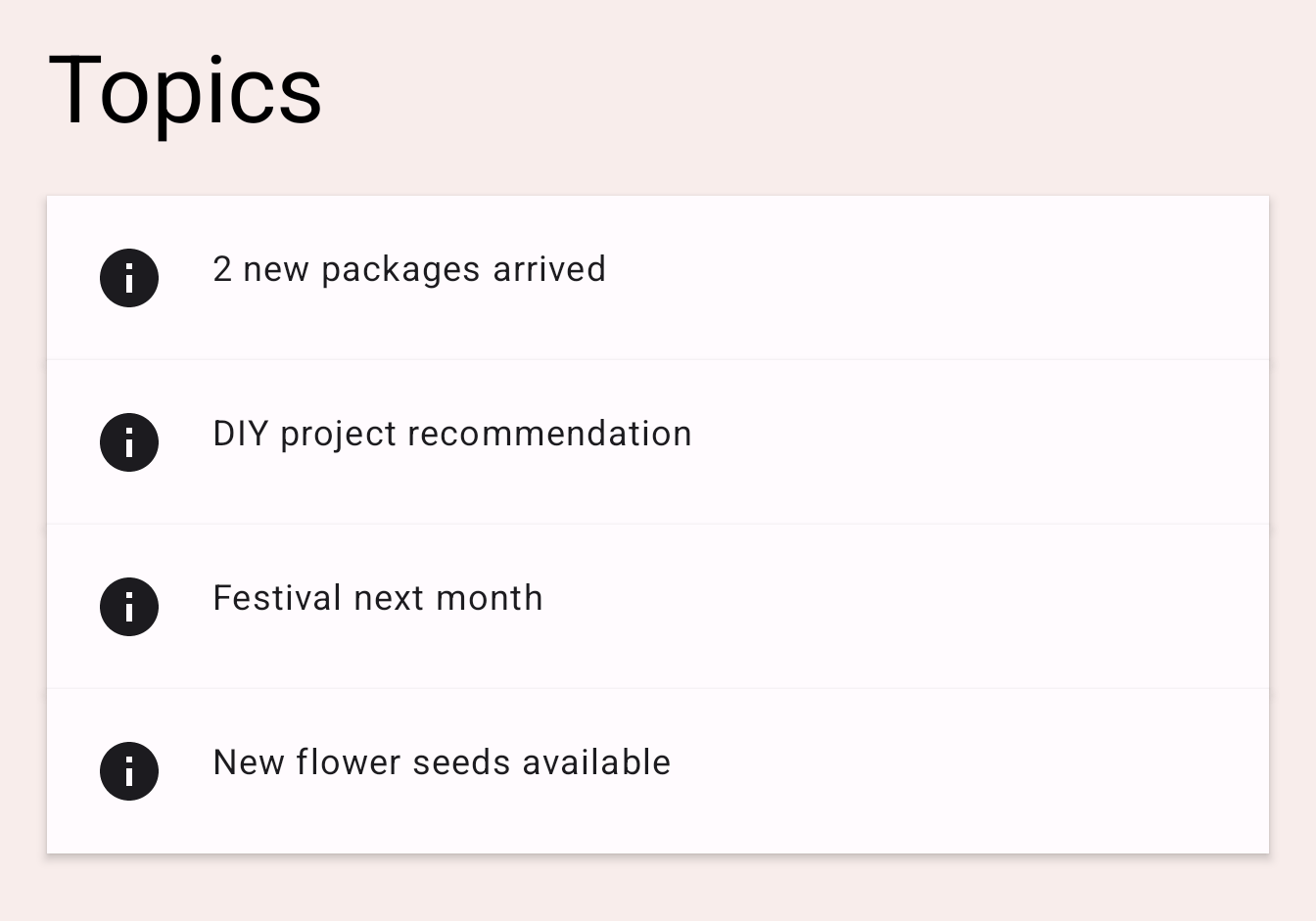
应用内容中显示了几个主题。尝试点击其中一个,它应该会展开并显示该主题的正文。包含文本的卡片在正文显示或隐藏时会展开和收缩。
|
|
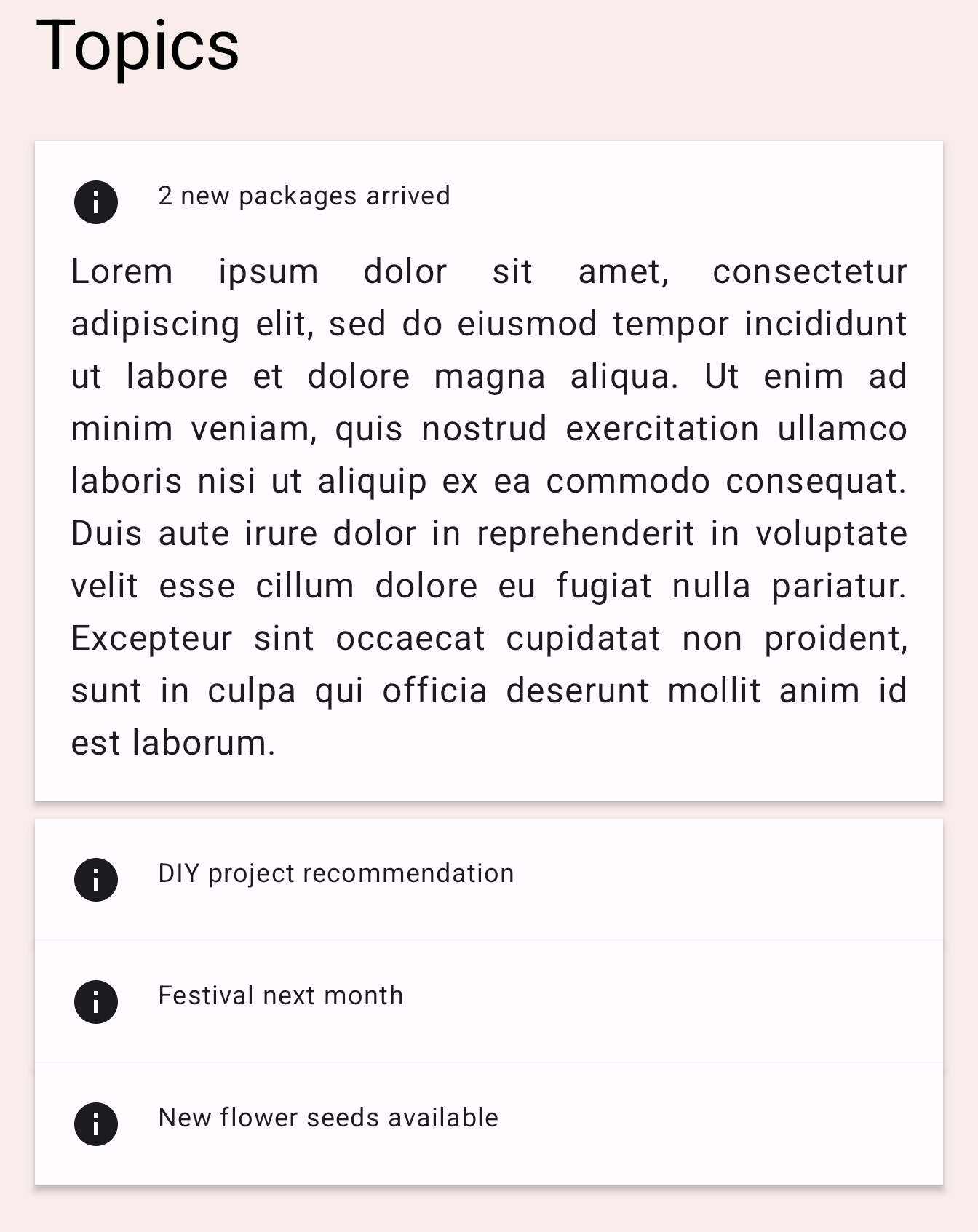
查看 TopicRow 可组合项中 TODO 3 的代码。
Column(
    modifier = Modifier
        .fillMaxWidth()
        .padding(16.dp)
) {
    // ... the title and the body
}
这里的 Column 可组合项会随着其内容的变化而改变大小。我们可以通过添加 animateContentSize 修饰符来为大小变化添加动画。
Column(
    modifier = Modifier
        .fillMaxWidth()
        .padding(16.dp)
        .animateContentSize()
) {
    // ... the title and the body
}
运行应用并点击其中一个主题。您可以看到它会展开和收缩,带有动画效果。
animateContentSize 也可以通过自定义 animationSpec 进行自定义。我们可以提供选项来更改动画类型,例如从弹性动画 (spring) 到补间动画 (tween) 等。有关更多信息,请参阅自定义动画文档。
6. 为多个值添加动画
现在我们熟悉了一些基本动画 API,接下来看看 Transition API,它允许我们创建更复杂的动画。使用 Transition API 可以跟踪 Transition 上的所有动画何时完成,这在使用之前看到的单独 animate*AsState API 时是不可能的。Transition API 还允许我们在不同状态之间进行过渡时定义不同的 transitionSpec。让我们看看如何使用它
在此示例中,我们自定义标签指示器。它是当前选定标签页上显示的矩形。
|
|
在 HomeTabIndicator 可组合项中找到 TODO 4,查看标签指示器是如何实现的。
val indicatorLeft = tabPositions[tabPage.ordinal].left
val indicatorRight = tabPositions[tabPage.ordinal].right
val color = if (tabPage == TabPage.Home) PaleDogwood else Green
这里,indicatorLeft 是指示器在标签行中左边缘的水平位置。indicatorRight 是指示器右边缘的水平位置。颜色也在浅粉色和绿色之间变化。
要同时为这些多个值添加动画,我们可以使用 Transition。Transition 可以通过 updateTransition 函数创建。将当前选定标签页的索引作为 targetState 参数传入。
每个动画值都可以使用 Transition 的 animate* 扩展函数声明。在此示例中,我们使用 animateDp 和 animateColor。它们接受一个 lambda 块,我们可以为每个状态指定目标值。我们已经知道它们的目标值应该是什么,所以我们可以像下面这样包装这些值。请注意,我们这里可以再次使用 by 声明,并将其设为局部委托属性,因为 animate* 函数返回一个 State 对象。
val transition = updateTransition(tabPage, label = "Tab indicator")
val indicatorLeft by transition.animateDp(label = "Indicator left") { page ->
   tabPositions[page.ordinal].left
}
val indicatorRight by transition.animateDp(label = "Indicator right") { page ->
   tabPositions[page.ordinal].right
}
val color by transition.animateColor(label = "Border color") { page ->
   if (page == TabPage.Home) PaleDogwood else Green
}
现在运行应用,您可以看到标签页切换现在更加有趣。随着点击标签页改变 tabPage 状态的值,与 transition 相关的所有动画值都会开始动画到目标状态指定的值。
此外,我们可以指定 transitionSpec 参数来自定义动画行为。例如,通过让靠近目的地的边缘移动得比另一条边缘更快,可以为指示器实现弹性效果。我们可以在 transitionSpec lambda 中使用 isTransitioningTo 中缀函数来确定状态变化的方向。
val transition = updateTransition(
    tabPage,
    label = "Tab indicator"
)
val indicatorLeft by transition.animateDp(
    transitionSpec = {
        if (TabPage.Home isTransitioningTo TabPage.Work) {
            // Indicator moves to the right.
            // The left edge moves slower than the right edge.
            spring(stiffness = Spring.StiffnessVeryLow)
        } else {
            // Indicator moves to the left.
            // The left edge moves faster than the right edge.
            spring(stiffness = Spring.StiffnessMedium)
        }
    },
    label = "Indicator left"
) { page ->
    tabPositions[page.ordinal].left
}
val indicatorRight by transition.animateDp(
    transitionSpec = {
        if (TabPage.Home isTransitioningTo TabPage.Work) {
            // Indicator moves to the right
            // The right edge moves faster than the left edge.
            spring(stiffness = Spring.StiffnessMedium)
        } else {
            // Indicator moves to the left.
            // The right edge moves slower than the left edge.
            spring(stiffness = Spring.StiffnessVeryLow)
        }
    },
    label = "Indicator right"
) { page ->
    tabPositions[page.ordinal].right
}
val color by transition.animateColor(
    label = "Border color"
) { page ->
    if (page == TabPage.Home) PaleDogwood else Green
}
再次运行应用并尝试切换标签页。
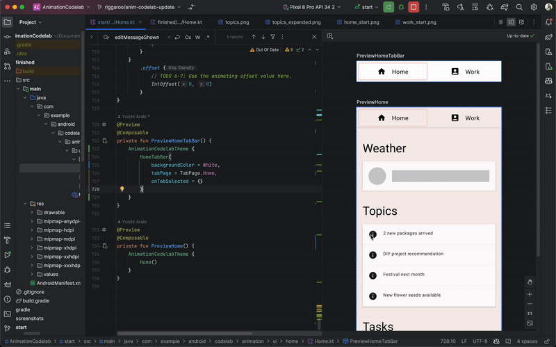
Android Studio 支持在 Compose 预览中检查 Transition。要使用动画预览,请在预览中可组合项的右上角点击“启动动画预览”图标 ( 图标) 来启动互动模式。尝试点击
 PreviewHomeTabBar 可组合项的图标。这将打开一个新的“动画”面板。
您可以通过点击“播放”图标按钮运行动画。您也可以在进度条上拖动以查看每个动画帧。为了更好地描述动画值,您可以在 updateTransition 和 animate* 方法中指定 label 参数。
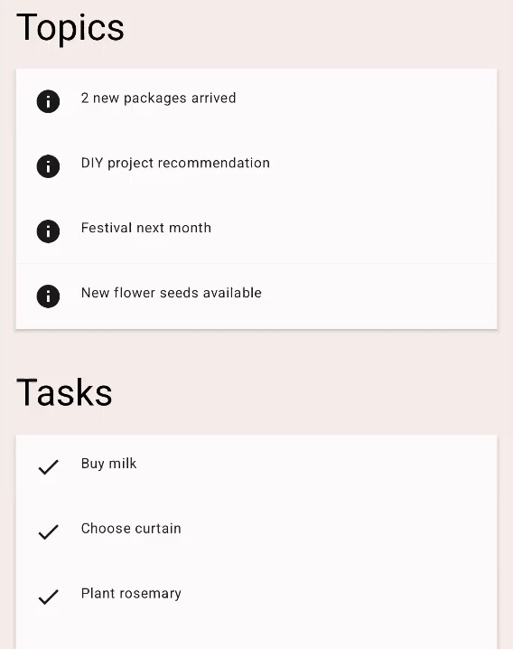
7. 重复动画
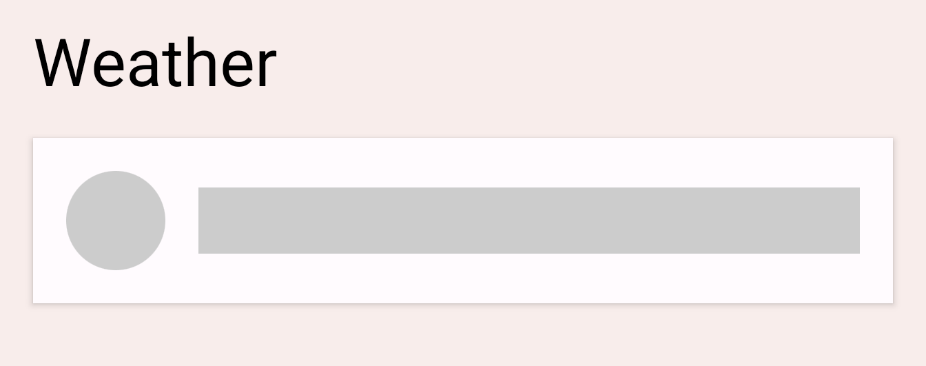
尝试点击当前温度旁边的刷新图标按钮。应用开始加载最新的天气信息(只是模拟)。在加载完成之前,您会看到一个加载指示器,它是一个灰色圆圈和一条进度条。我们来为这个指示器的 alpha 值添加动画,使其更清楚地表明过程正在进行中。
在 LoadingRow 可组合项中找到 TODO 5。
val alpha = 1f
我们希望这个值在 0f 和 1f 之间重复动画。我们可以为此使用 InfiniteTransition。此 API 与上一节中的 Transition API 类似。它们都可以为多个值添加动画,但 Transition 基于状态变化为值添加动画,而 InfiniteTransition 无限期地为值添加动画。
要创建 InfiniteTransition,请使用 rememberInfiniteTransition 函数。然后,可以使用 InfiniteTransition 的 animate* 扩展函数之一声明每个动画值变化。在这种情况下,我们正在为 alpha 值添加动画,因此我们使用 animatedFloat。initialValue 参数应为 0f,targetValue 应为 1f。我们也可以为这个动画指定一个 AnimationSpec,但这个 API 只接受 InfiniteRepeatableSpec。使用 infiniteRepeatable 函数创建一个。这个 AnimationSpec 会包装任何基于持续时间的 AnimationSpec 并使其可重复。例如,结果代码应如下所示。
val infiniteTransition = rememberInfiniteTransition()
val alpha by infiniteTransition.animateFloat(
    initialValue = 0f,
    targetValue = 1f,
    animationSpec = infiniteRepeatable(
        animation = keyframes {
            durationMillis = 1000
            0.7f at 500
        },
        repeatMode = RepeatMode.Reverse
    ),
    label = "alpha"
)
默认的 repeatMode 是 RepeatMode.Restart。这会从 initialValue 过渡到 targetValue,然后从 initialValue 重新开始。通过将 repeatMode 设置为 RepeatMode.Reverse,动画会从 initialValue 进行到 targetValue,然后从 targetValue 进行到 initialValue。动画从 0 进行到 1,然后从 1 进行到 0。
keyFrames 动画是另一种 animationSpec 类型(其他一些类型包括 tween 和 spring),它允许在不同毫秒处更改进行中的值。我们最初将 durationMillis 设置为 1000 毫秒。然后我们可以定义动画中的关键帧,例如,在动画的 500 毫秒处,我们希望 alpha 值为 0.7f。这将改变动画的进程:它将在动画的 500 毫秒内从 0 快速 진행 到 0.7,然后在动画的 500 毫秒到 1000 毫秒内从 0.7 进行到 1.0,并在结束时减速。
如果我们需要多个关键帧,我们可以按如下方式定义多个 keyFrames
animation = keyframes {
   durationMillis = 1000
   0.7f at 500
   0.9f at 800
}
运行应用并尝试点击刷新按钮。您现在可以看到加载指示器正在动画。
8. 手势动画
在最后一部分,我们将学习如何基于触摸输入运行动画。我们将从头开始构建一个 swipeToDismiss 修饰符。
在 swipeToDismiss 修饰符中找到 TODO 6-1。这里,我们正在尝试创建一个修饰符,使元素可以通过触摸滑动。当元素被甩到屏幕边缘时,我们调用 onDismissed 回调,以便可以移除该元素。
要构建 swipeToDismiss 修饰符,我们需要理解几个关键概念。首先,用户将手指放在屏幕上,生成具有 x 和 y 坐标的触摸事件,然后他们会向右或向左移动手指——根据他们的移动来移动 x 和 y。他们触摸的项目需要随其手指移动,因此我们将根据触摸事件的位置和速度更新项目的位置。
我们可以使用Compose 手势文档中描述的几个概念。使用pointerInput 修饰符,我们可以低级别访问传入的指针触摸事件,并使用同一指针跟踪用户拖动的速度。如果他们在项目超过可解除边界之前松手,项目将弹回原位。
在这种场景下需要考虑一些独特的事情。首先,任何正在进行的动画都可能被触摸事件拦截。其次,动画值可能不是唯一的真实来源。换句话说,我们可能需要将动画值与来自触摸事件的值同步。
Animatable 是我们目前为止看到的最低级别 API。它在手势场景中具有多个有用的特性,例如能够立即吸附到手势传入的新值,以及在触发新的触摸事件时停止任何正在进行的动画。让我们创建一个 Animatable 实例,并用它来表示可滑动元素的水平偏移量。请确保从 androidx.compose.animation.core.Animatable 导入 Animatable,而不是从 androidx.compose.animation.Animatable 导入。
val offsetX = remember { Animatable(0f) } // Add this line
// used to receive user touch events
pointerInput {
    // Used to calculate a settling position of a fling animation.
    val decay = splineBasedDecay<Float>(this)
    // Wrap in a coroutine scope to use suspend functions for touch events and animation.
    coroutineScope {
        while (true) {
            // ...
在 TODO 6-2 处,我们刚刚收到了一个按下触摸事件。如果动画当前正在运行,我们应该拦截它。这可以通过在 Animatable 上调用 stop 来实现。请注意,如果动画未运行,此调用将被忽略。VelocityTracker 将用于计算用户从左到右移动的速度。awaitPointerEventScope 是一个 suspend 函数,它可以等待用户输入事件并对其进行响应。
// Wait for a touch down event. Track the pointerId based on the touch
val pointerId = awaitPointerEventScope { awaitFirstDown().id }
offsetX.stop() // Add this line to cancel any on-going animations
// Prepare for drag events and record velocity of a fling gesture
val velocityTracker = VelocityTracker()
// Wait for drag events.
awaitPointerEventScope {
在 TODO 6-3 处,我们正在持续接收拖动事件。我们必须将触摸事件的位置同步到动画值中。为此,我们可以使用 Animatable 上的 snapTo。snapTo 必须在另一个 launch 块内调用,因为 awaitPointerEventScope 和 horizontalDrag 是受限制的协程作用域。这意味着它们只能对 awaitPointerEvents 进行 suspend 操作,而 snapTo 不是指针事件。
horizontalDrag(pointerId) { change ->
    // Add these 4 lines
    // Get the drag amount change to offset the item with
    val horizontalDragOffset = offsetX.value + change.positionChange().x
    // Need to call this in a launch block in order to run it separately outside of the awaitPointerEventScope
    launch {
        // Instantly set the Animable to the dragOffset to ensure its moving
        // as the user's finger moves
        offsetX.snapTo(horizontalDragOffset)
    }
    // Record the velocity of the drag.
    velocityTracker.addPosition(change.uptimeMillis, change.position)

    // Consume the gesture event, not passed to external
    if (change.positionChange() != Offset.Zero) change.consume()

}
TODO 6-4 是元素刚刚被释放和甩出的地方。我们需要计算甩出最终稳定到的位置,以便决定是将元素滑回原始位置,还是将其滑走并调用回调。我们使用之前创建的 decay 对象来计算 targetOffsetX
// Dragging finished. Calculate the velocity of the fling.
val velocity = velocityTracker.calculateVelocity().x
// Add this line to calculate where it would end up with
// the current velocity and position
val targetOffsetX = decay.calculateTargetValue(offsetX.value, velocity)
在 TODO 6-5 处,我们即将开始动画。但在那之前,我们想为 Animatable 设置上限和下限值,以便它一到达边界就停止(-size.width 和 size.width,因为我们不希望 offsetX 能够超出这两个值)。pointerInput 修饰符允许我们通过 size 属性访问元素的大小,所以我们使用它来获取边界。
offsetX.updateBounds(
    lowerBound = -size.width.toFloat(),
    upperBound = size.width.toFloat()
)
在 TODO 6-6 处,我们终于可以开始动画了。我们首先比较之前计算的甩出稳定位置和元素的大小。如果稳定位置小于大小,则表示甩出的速度不够。我们可以使用 animateTo 将值动画回 0f。否则,我们使用 animateDecay 开始甩出动画。当动画完成(很可能是通过我们之前设置的边界)时,我们可以调用回调。
launch {
    if (targetOffsetX.absoluteValue <= size.width) {
        // Not enough velocity; Slide back.
        offsetX.animateTo(targetValue = 0f, initialVelocity = velocity)
    } else {
        // Enough velocity to slide away the element to the edge.
        offsetX.animateDecay(velocity, decay)
        // The element was swiped away.
        onDismissed()
    }
}
最后,请看 TODO 6-7。我们已经设置好所有动画和手势,所以不要忘记将偏移量应用到元素,这将把屏幕上的元素移动到手势或动画产生的值所指定的位置
.offset { IntOffset(offsetX.value.roundToInt(), 0) }
本节结束后,您将得到如下所示的代码
private fun Modifier.swipeToDismiss(
    onDismissed: () -> Unit
): Modifier = composed {
    // This Animatable stores the horizontal offset for the element.
    val offsetX = remember { Animatable(0f) }
    pointerInput(Unit) {
        // Used to calculate a settling position of a fling animation.
        val decay = splineBasedDecay<Float>(this)
        // Wrap in a coroutine scope to use suspend functions for touch events and animation.
        coroutineScope {
            while (true) {
                // Wait for a touch down event.
                val pointerId = awaitPointerEventScope { awaitFirstDown().id }
                // Interrupt any ongoing animation.
                offsetX.stop()
                // Prepare for drag events and record velocity of a fling.
                val velocityTracker = VelocityTracker()
                // Wait for drag events.
                awaitPointerEventScope {
                    horizontalDrag(pointerId) { change ->
                        // Record the position after offset
                        val horizontalDragOffset = offsetX.value + change.positionChange().x
                        launch {
                            // Overwrite the Animatable value while the element is dragged.
                            offsetX.snapTo(horizontalDragOffset)
                        }
                        // Record the velocity of the drag.
                        velocityTracker.addPosition(change.uptimeMillis, change.position)
                        // Consume the gesture event, not passed to external
                        change.consumePositionChange()
                    }
                }
                // Dragging finished. Calculate the velocity of the fling.
                val velocity = velocityTracker.calculateVelocity().x
                // Calculate where the element eventually settles after the fling animation.
                val targetOffsetX = decay.calculateTargetValue(offsetX.value, velocity)
                // The animation should end as soon as it reaches these bounds.
                offsetX.updateBounds(
                    lowerBound = -size.width.toFloat(),
                    upperBound = size.width.toFloat()
                )
                launch {
                    if (targetOffsetX.absoluteValue <= size.width) {
                        // Not enough velocity; Slide back to the default position.
                        offsetX.animateTo(targetValue = 0f, initialVelocity = velocity)
                    } else {
                        // Enough velocity to slide away the element to the edge.
                        offsetX.animateDecay(velocity, decay)
                        // The element was swiped away.
                        onDismissed()
                    }
                }
            }
        }
    }
        // Apply the horizontal offset to the element.
        .offset { IntOffset(offsetX.value.roundToInt(), 0) }
}
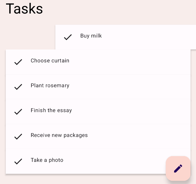
运行应用并尝试滑动其中一个任务项。您会看到元素根据您的甩出速度,要么滑回默认位置,要么滑走并被移除。您还可以在元素正在动画时捕获它。
9. 恭喜!
恭喜!您已学习了基本的 Compose 动画 API。
在本 Codelab 中,我们学习了如何使用
高级动画 API
animatedContentSizeAnimatedVisibility
低级动画 API
- 用于为单个值添加动画的
animate*AsState - 用于为多个值添加动画的
updateTransition - 用于无限期为值添加动画的
infiniteTransition - 用于构建带触摸手势的自定义动画的
Animatable
接下来是什么?
查看Compose 学习路径上的其他 Codelab。
要了解更多信息,请参阅Compose 动画和这些参考文档